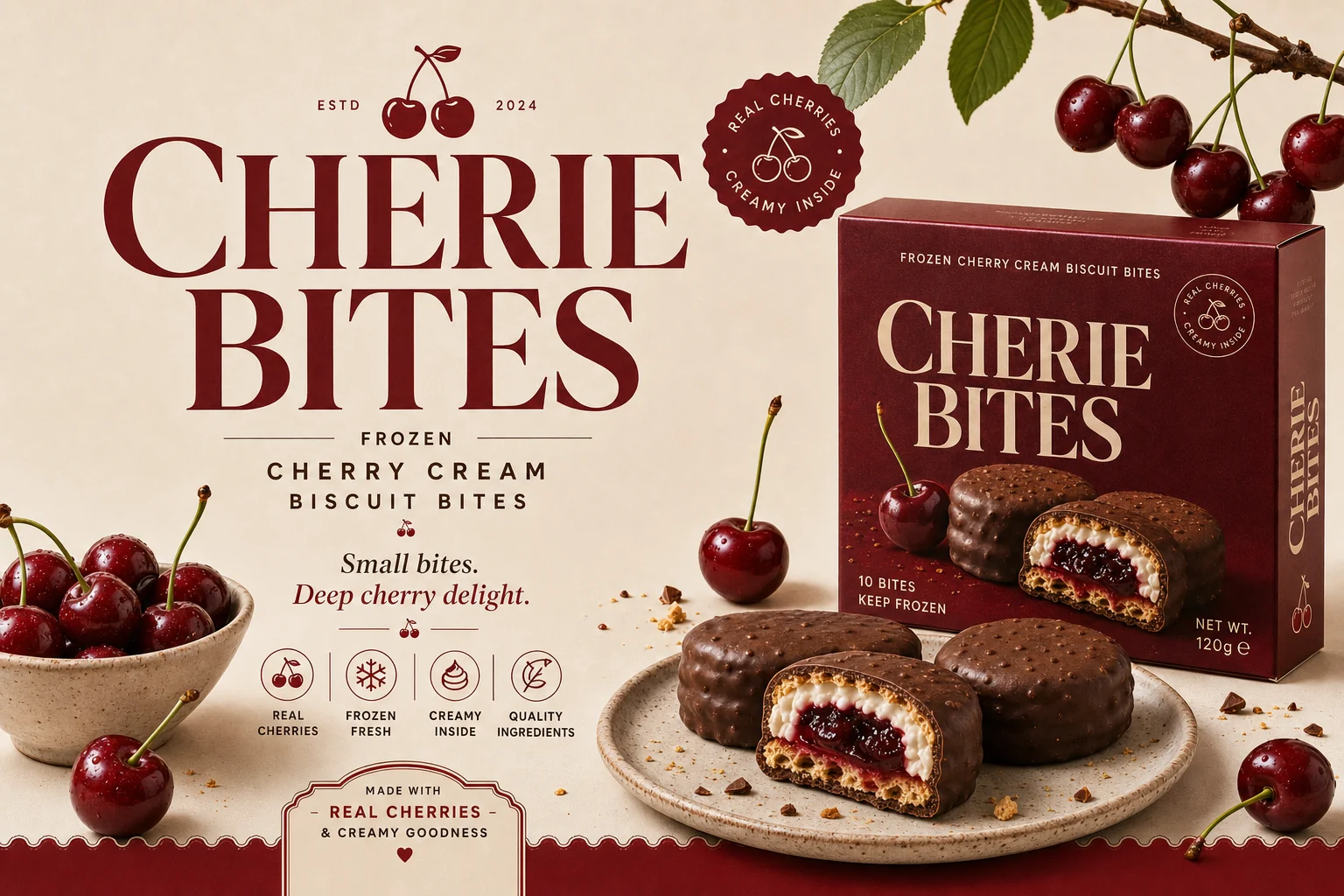
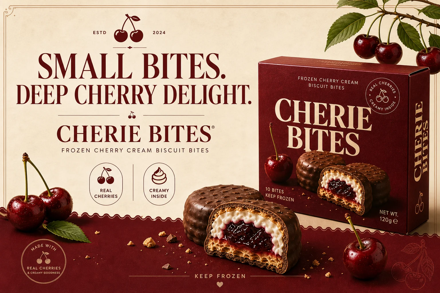
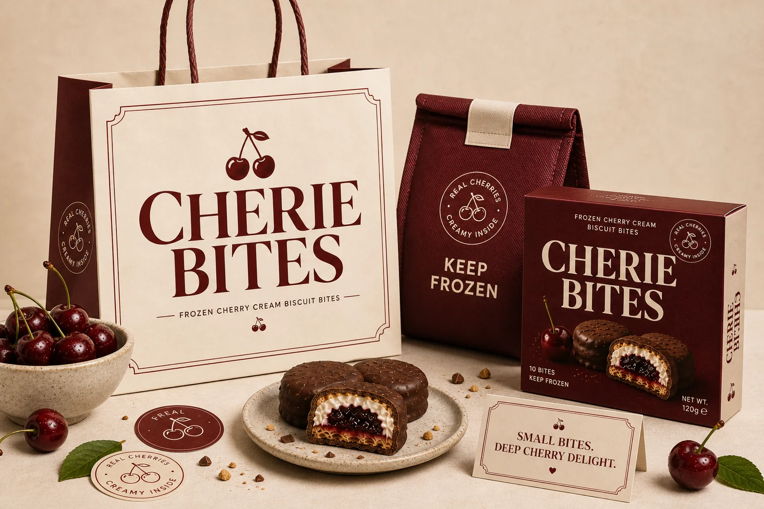
A frozen dessert identity built around one fast product read.
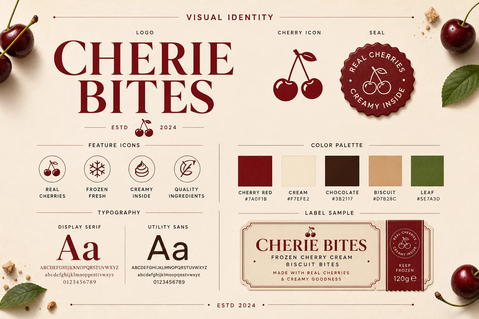
CHERIE BITES is a fictional frozen cherry cream biscuit brand. The system needed to feel appetising at first glance, but still structured enough for retail packaging, freezer labels, campaign posters and social launch assets.
The visual language uses deep cherry red, cream paper, scallop borders, product cutaways and a seal device to make the product feel sweet, recognisable and shelf-ready.
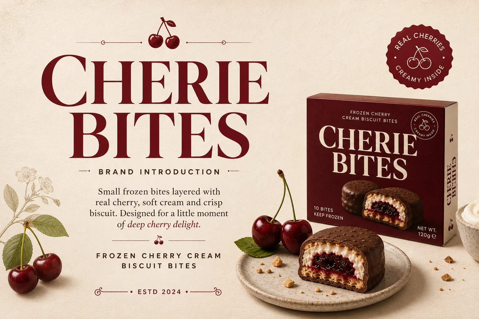
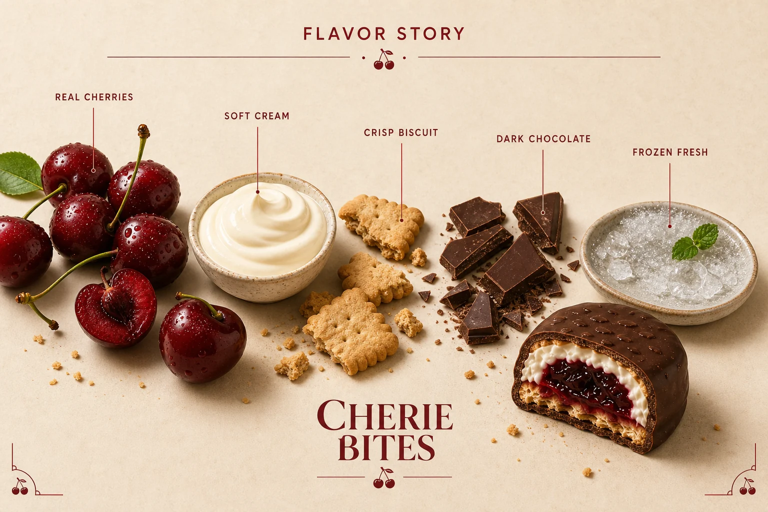
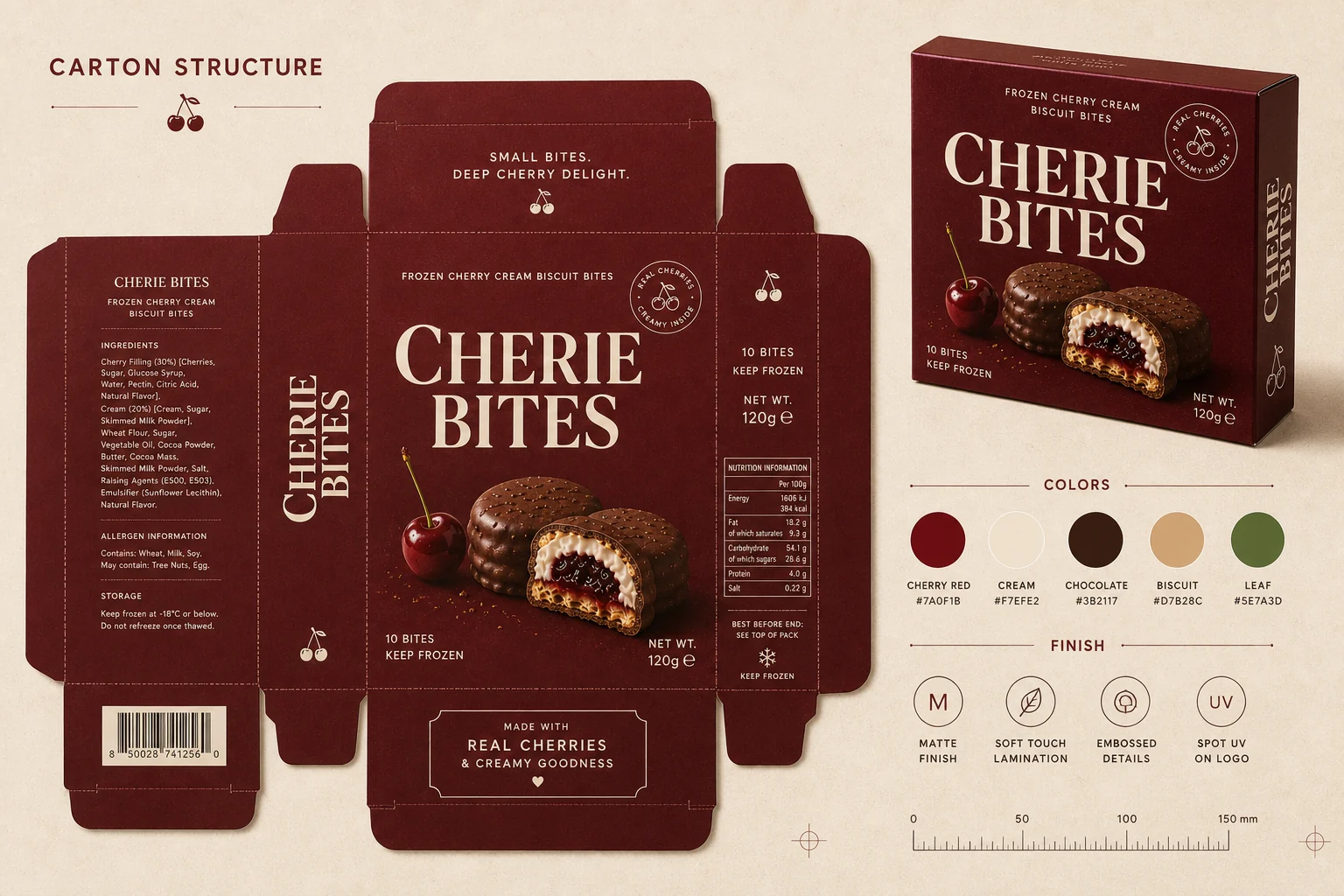
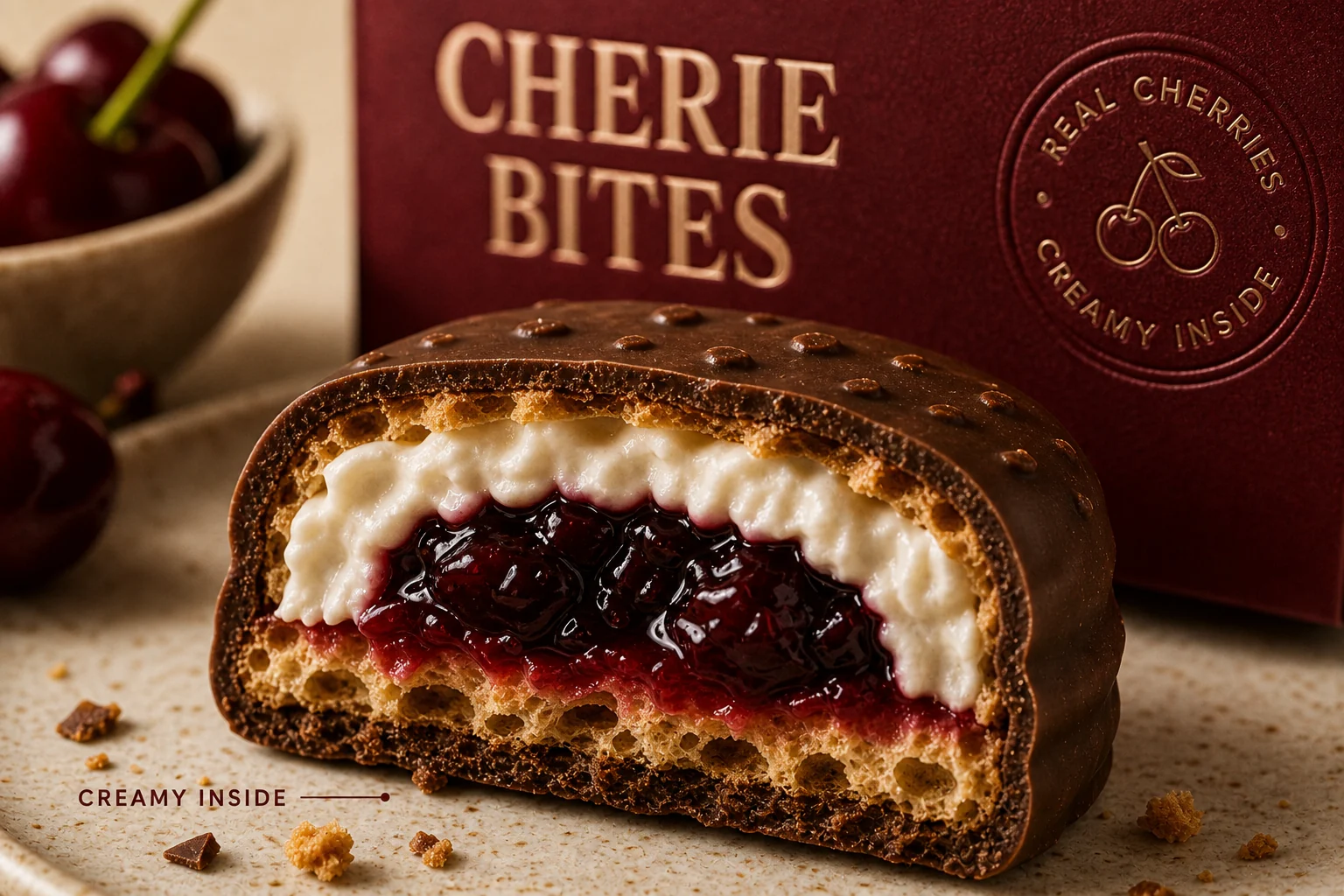
The product story starts with appetite, not decoration.
The close-up and cutaway make the offer obvious: chocolate biscuit, cream centre and dark cherry filling. The brand elements stay present without blocking the food moment.

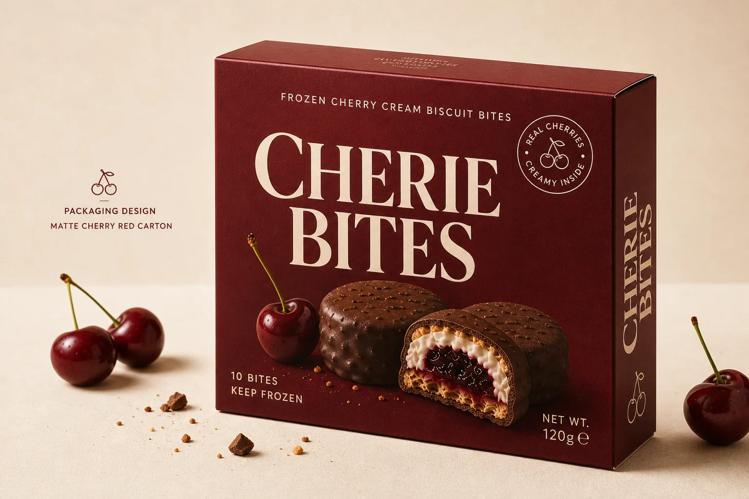
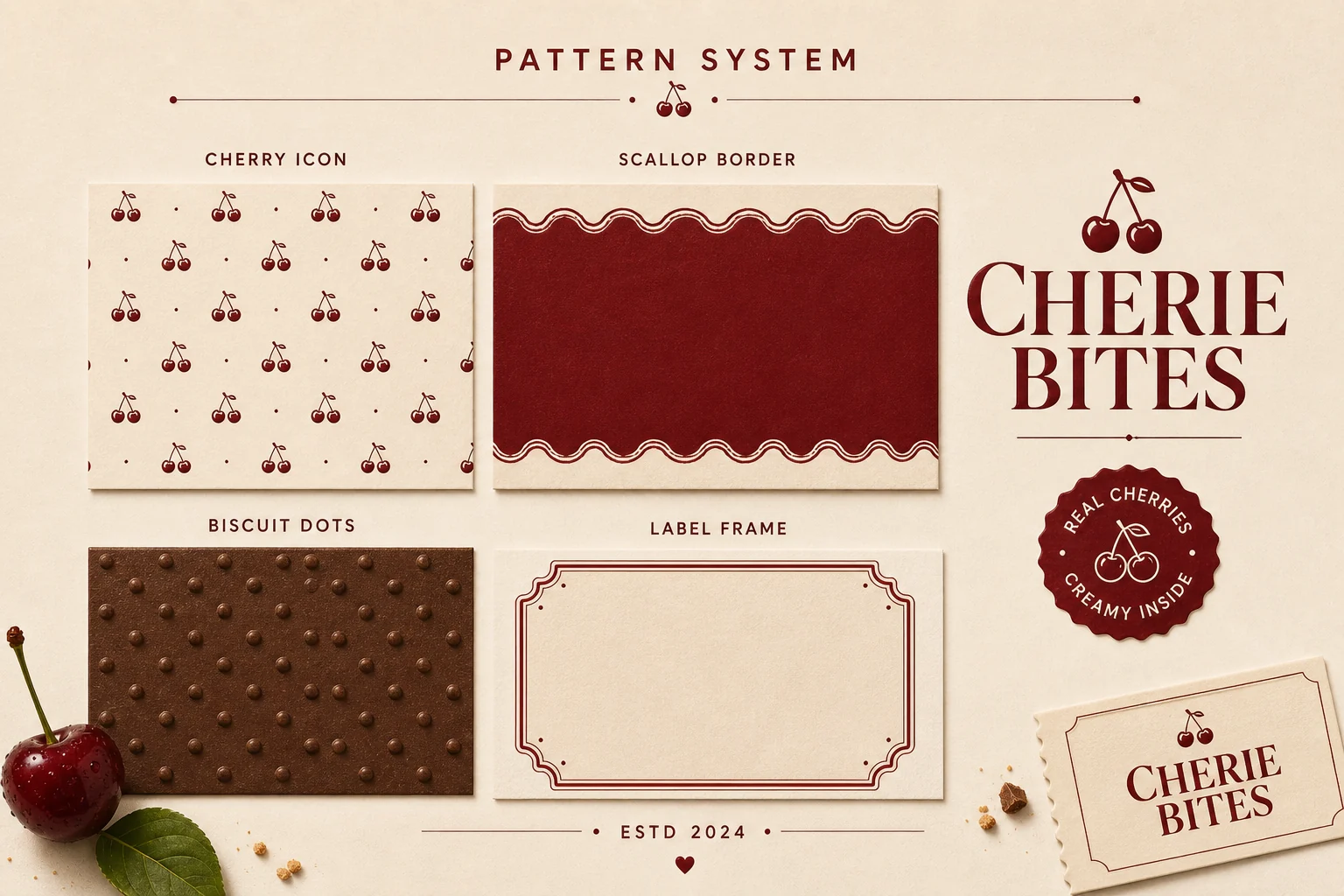
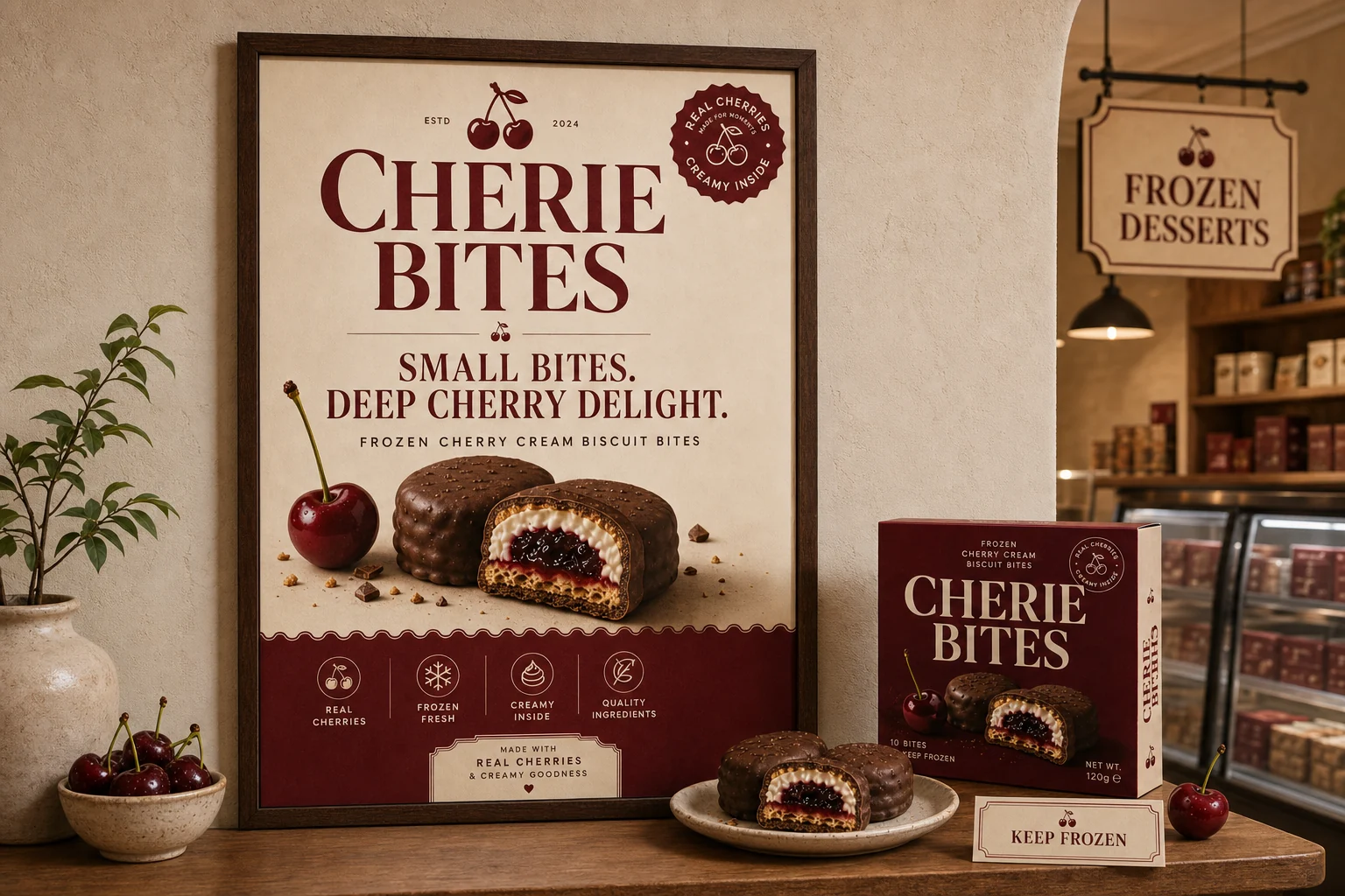
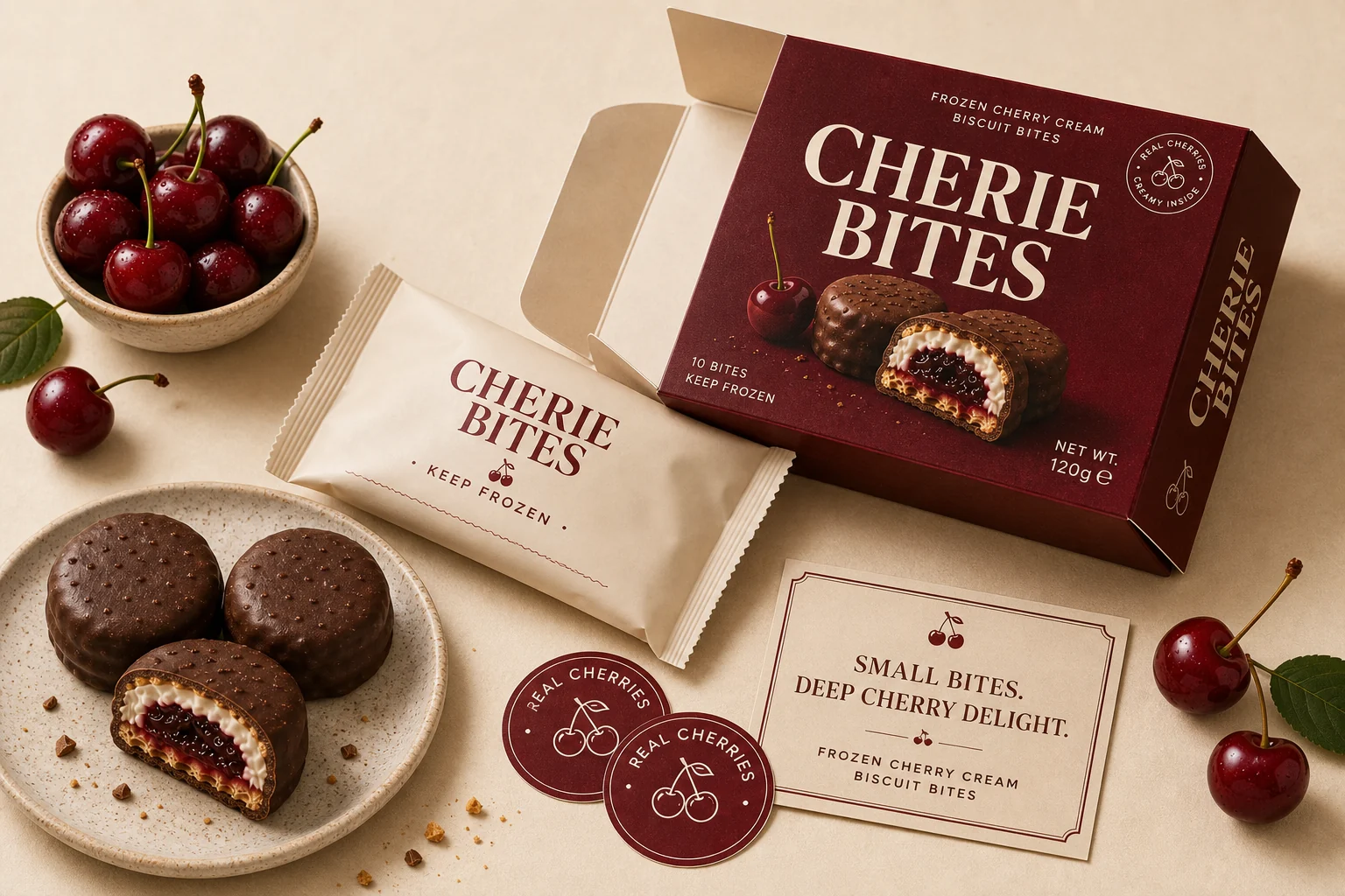
Identity details give the carton a repeatable retail language.
The logo, seal, carton dieline and pattern library keep the system useful beyond one hero mockup. Each element can move onto labels, tissue, stickers and small campaign placements.
The brand has to read inside a freezer, on a poster and at the counter.
Retail applications test scale. The red carton needs to hold shelf presence, while campaign and wall posters keep the message short and product-led.
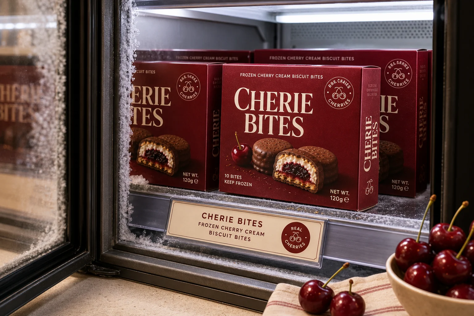
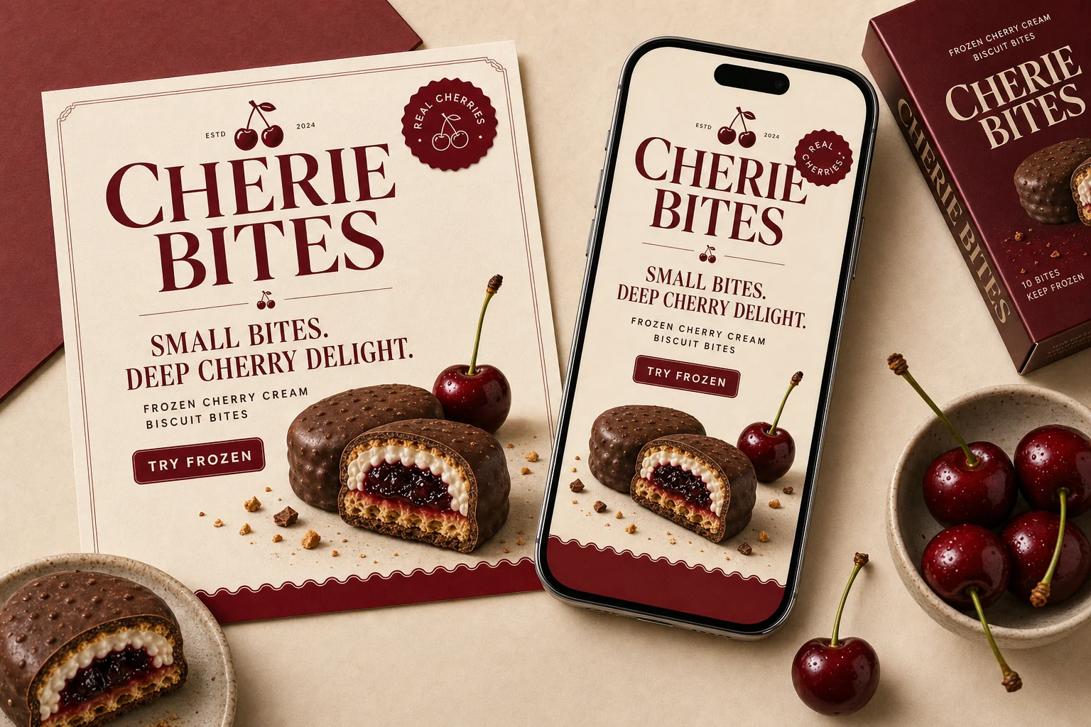
Launch assets keep the same cherry signal across unboxing, social and carry-out.
Every application keeps one job clear: show the product, repeat the cherry-red brand block and give shoppers a fast reason to try it frozen.
Why this belongs in Featured Projects
CHERIE BITES adds a food retail system to the YL portfolio: packaging-first, product-led, and easy to understand in a real buying environment.
Need packaging that sells the product before anyone reads the details?
Use this route when your product needs shelf clarity, packaging hierarchy, campaign assets and social launch visuals working as one system.