InputOne existing assetMenu, poster, price list, social grid, resume or portfolio page.
Review3 to 5 clarity issuesHierarchy, spacing, type, colour, consistency and real-world use.
DirectionOne cleaner routeA sample visual direction before committing to a larger project.
DeliveryPDF summaryIssue notes, recommendation and next step after the review.
A practical ladder: from one unclear asset to a complete visual world.
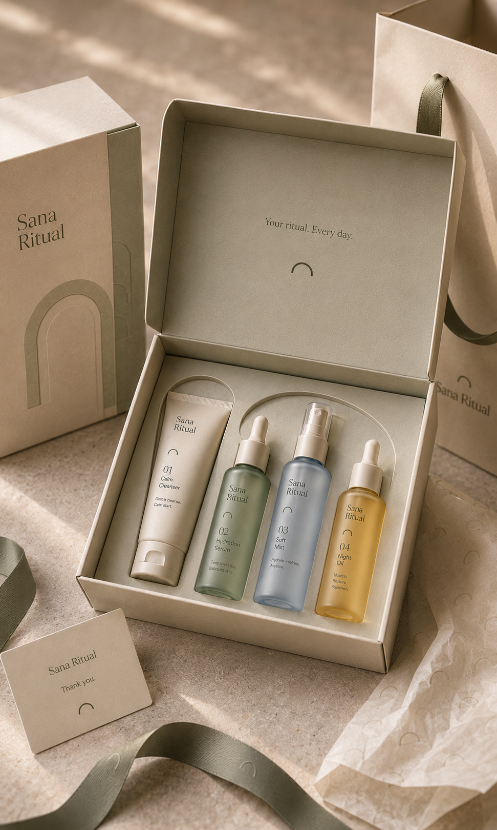
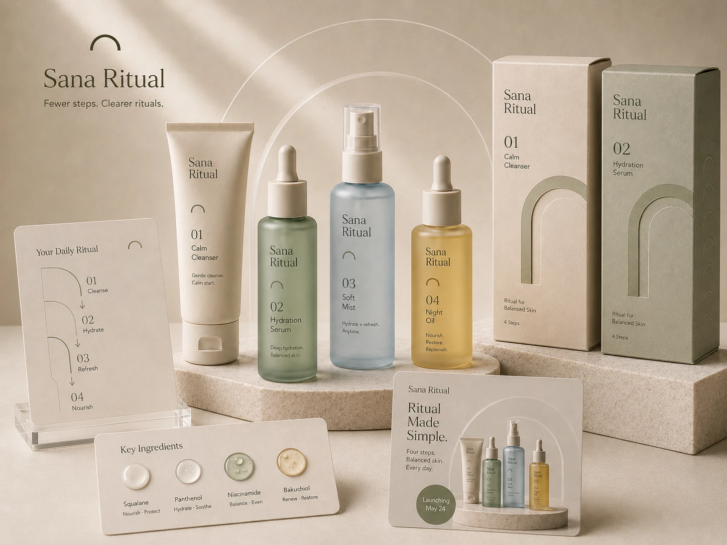
Some examples are concept or sample-based because YL often works on private small-business materials that cannot always be shown publicly. They are included to show the kind of problems, deliverables and visual direction this studio can handle.
BeforeAfter direction
12-Hour Visual FixMenu fixFrom A$99
Corner Brew Menu Fix
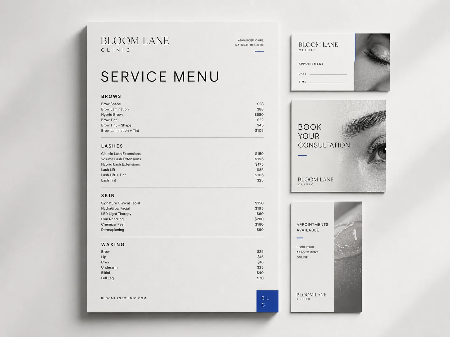
The same menu content becomes easier to scan, calmer to read and more recognisable as a local cafe.
BeforeGood information felt generic, crowded and difficult to scan quickly.
Fix directionClearer sections, stronger type hierarchy, calmer spacing and a more ownable side panel.
You receive3 to 5 issue notes, one sample direction, PDF review summary and recommended next step.
Good fitCafes, restaurants and local businesses with an existing menu or price list.
TimelineWithin 12 hours after materials, scope and payment are complete.
Proof pointThe same content reads faster with clearer hierarchy and calmer spacing.