Project Brief
A performance brand that makes product function visible at speed.
MOVE+ was created to show how a sports nutrition brand can feel fast, functional and shelf-ready without losing system logic. Each product mode has its own color, benefit stack and athlete cue, while the core wordmark keeps the range recognisable.
The value is in the rollout: the same identity works on cans, stick packs, energy bars, campaign posters, apparel, bags and real training scenes.
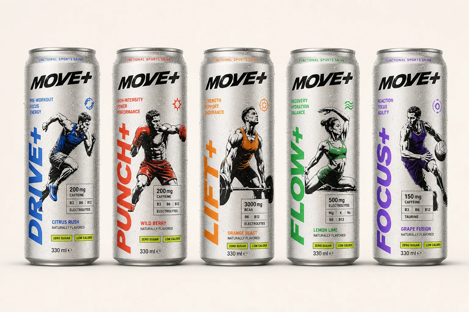
Core Product Range
Five modes, one visual system.
The drink range uses color-coded product names, athlete illustrations and benefit panels to make each function distinct while keeping the family clearly connected.
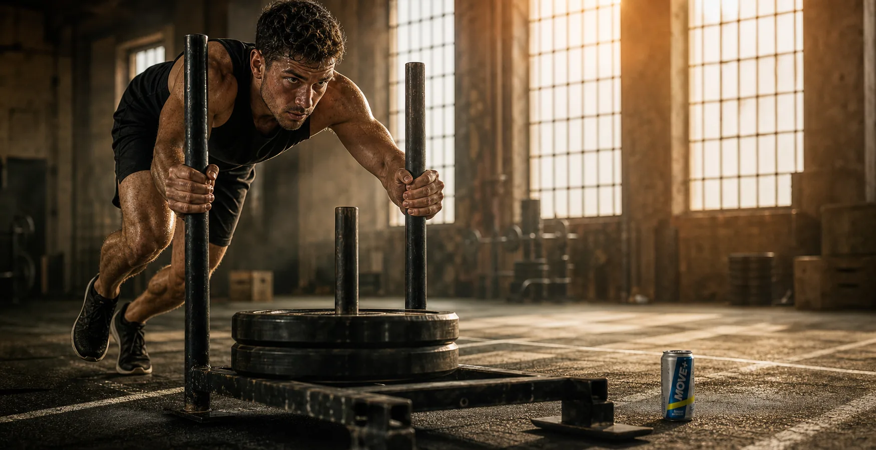
Training World
The brand feels built for work, not just packaging mockups.
Training scenes test whether MOVE+ can live in real performance contexts: sled push, resistance work, recovery outdoors and high-intensity sprint energy.
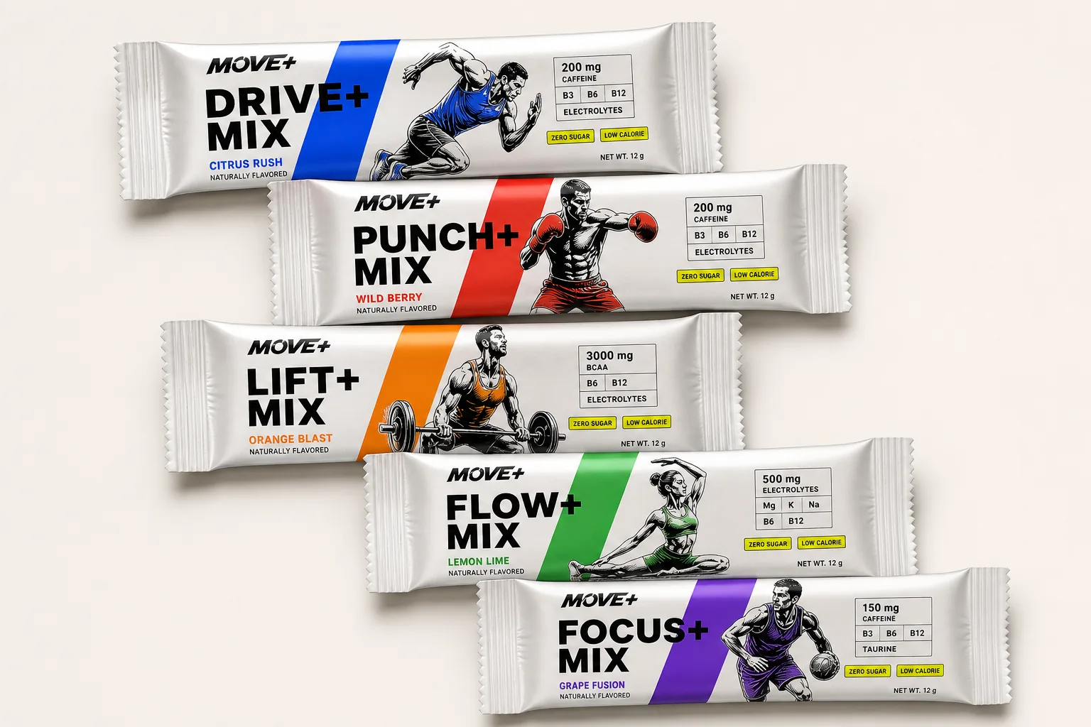
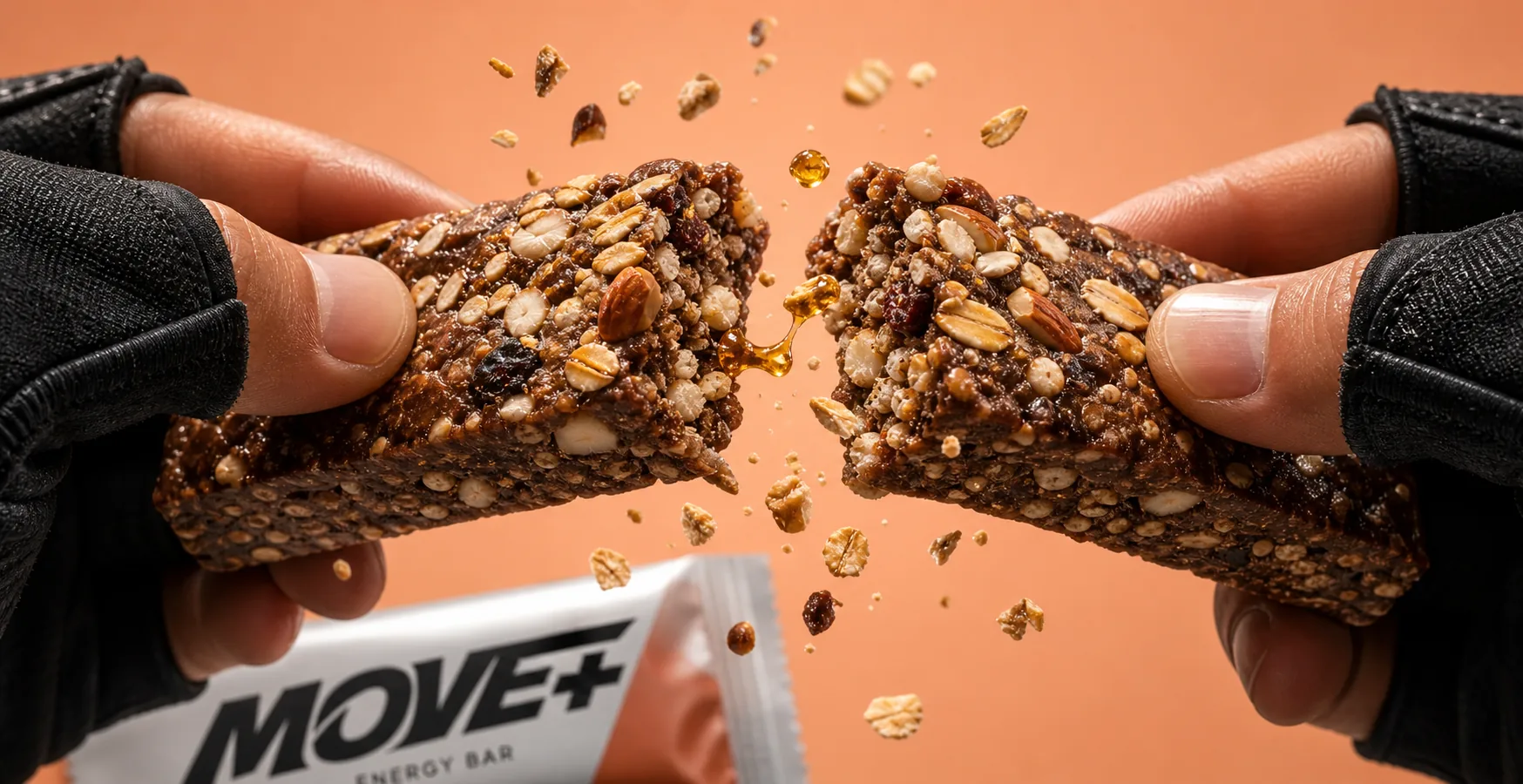
Fuel Moment
The system extends from drink range into food energy.
The energy bar visual direction keeps the same black-and-white brand confidence while shifting the product story toward texture, ingredients and quick recovery.
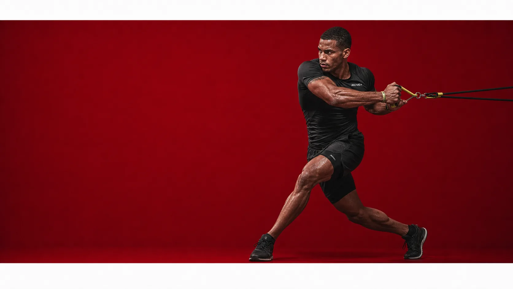
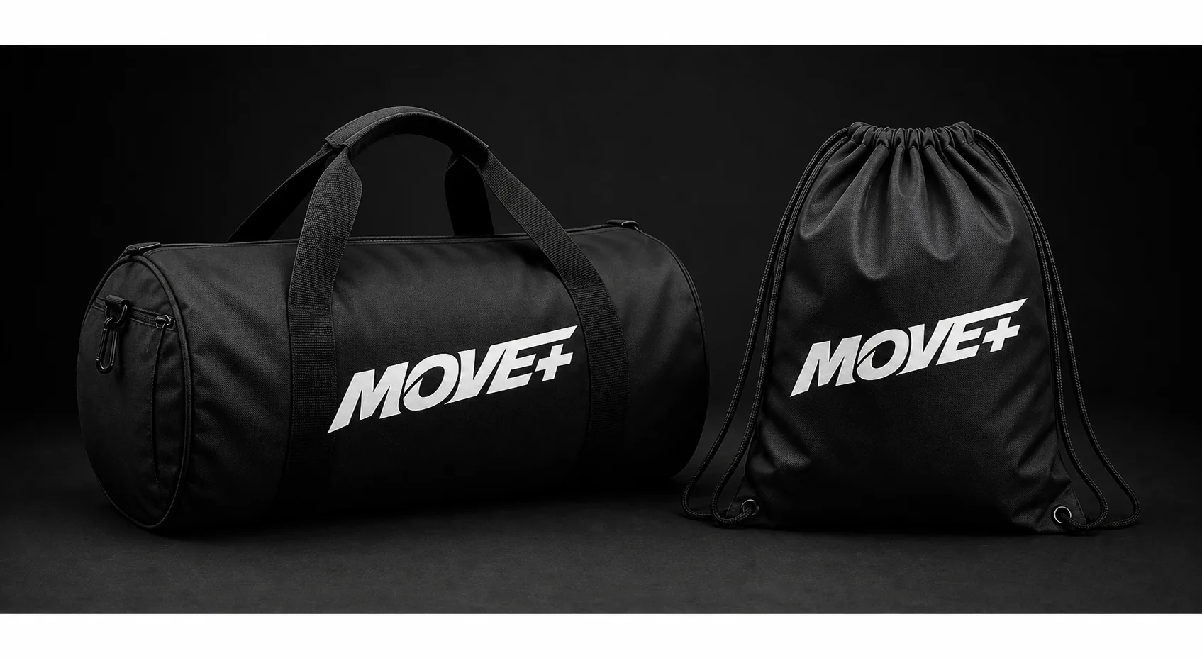
Brand Surfaces
The wordmark holds on apparel, fabric and training gear.
Black gear, fabric marks and campaign applications keep the brand direct and durable across the gym, the bag and the product shelf.
Why this belongs in Featured Projects
MOVE+ expands the studio signal into performance consumer goods.
Start a similar project
Need a product system that can move from shelf to campaign?
Use this route when your brand needs packaging logic, product range clarity, campaign visuals and launch-ready applications working together.