A Melbourne coffee roastery / Est. 2024
Clarity in flavour. Precision in roast. Ritual in every cup.
NORTHLINE ROASTERS is a fictional roastery identity built around a sharper coffee language: cold metal surfaces, disciplined type, simple off-white packaging and one quiet lavender signal for roast information.
The system needed to hold from shelf to counter: whole bean bags, roast labels, stationery, cups, cold brew, storefront signage, tote merchandise, subscription packaging and menu communication.
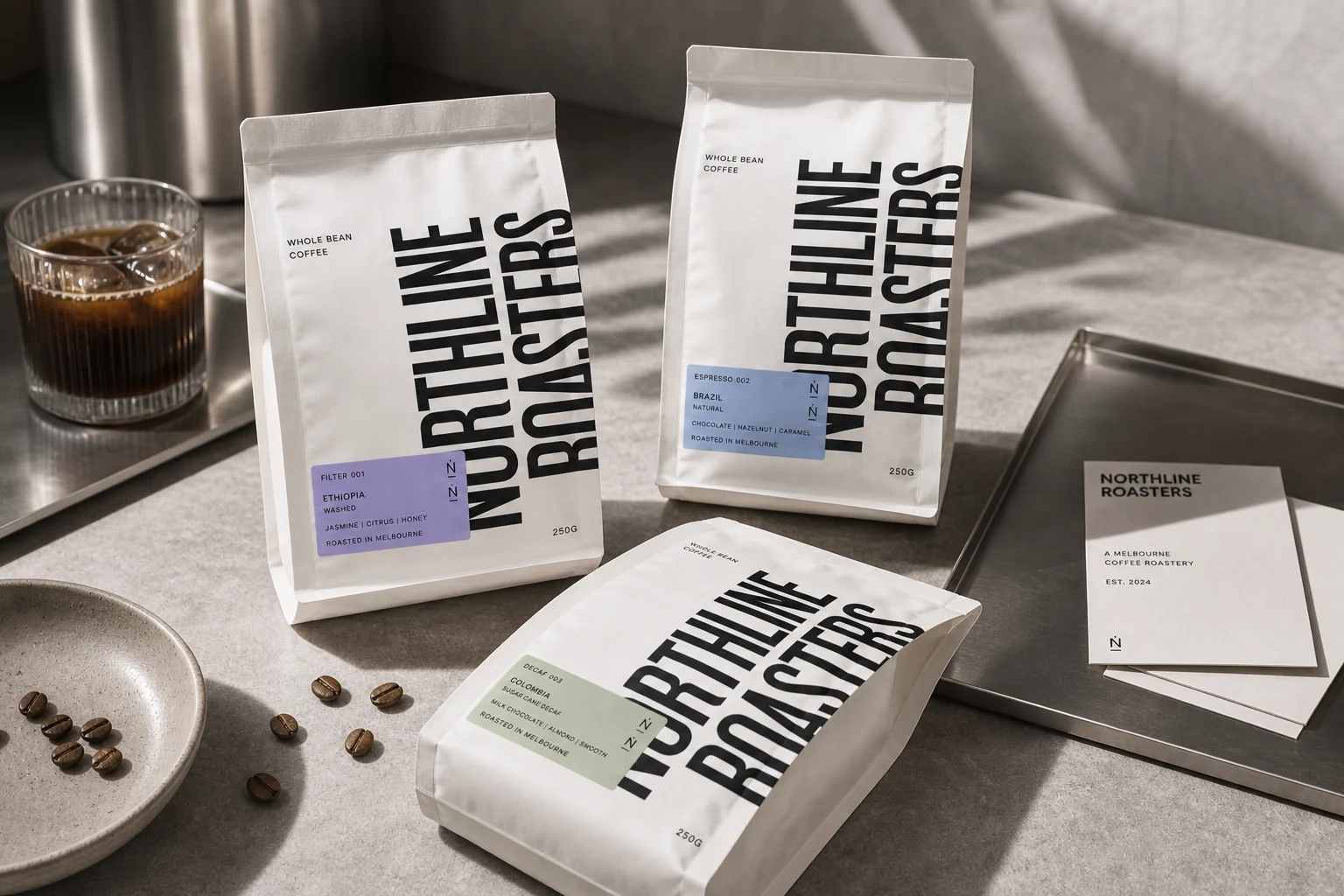
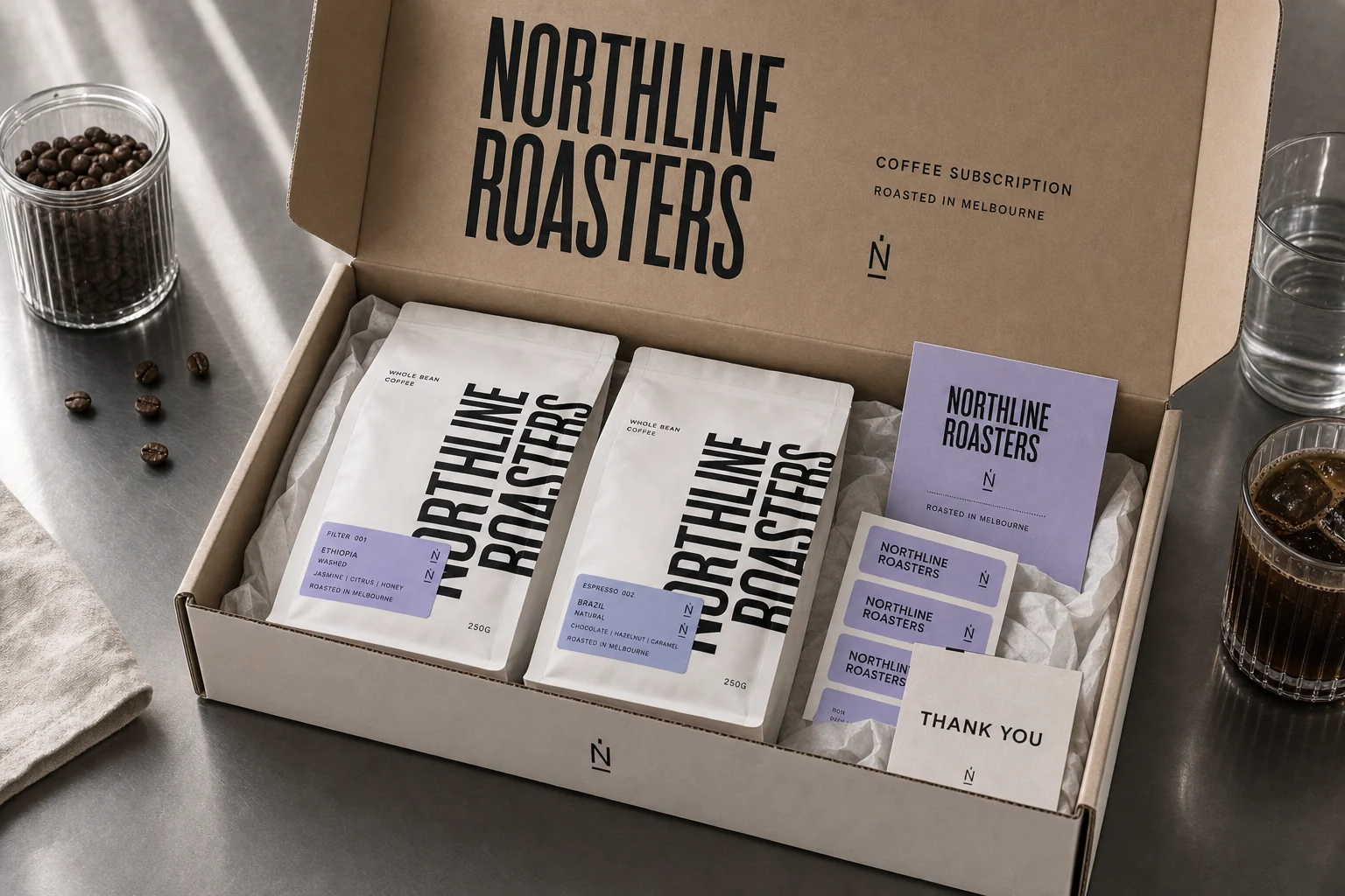
Packaging system
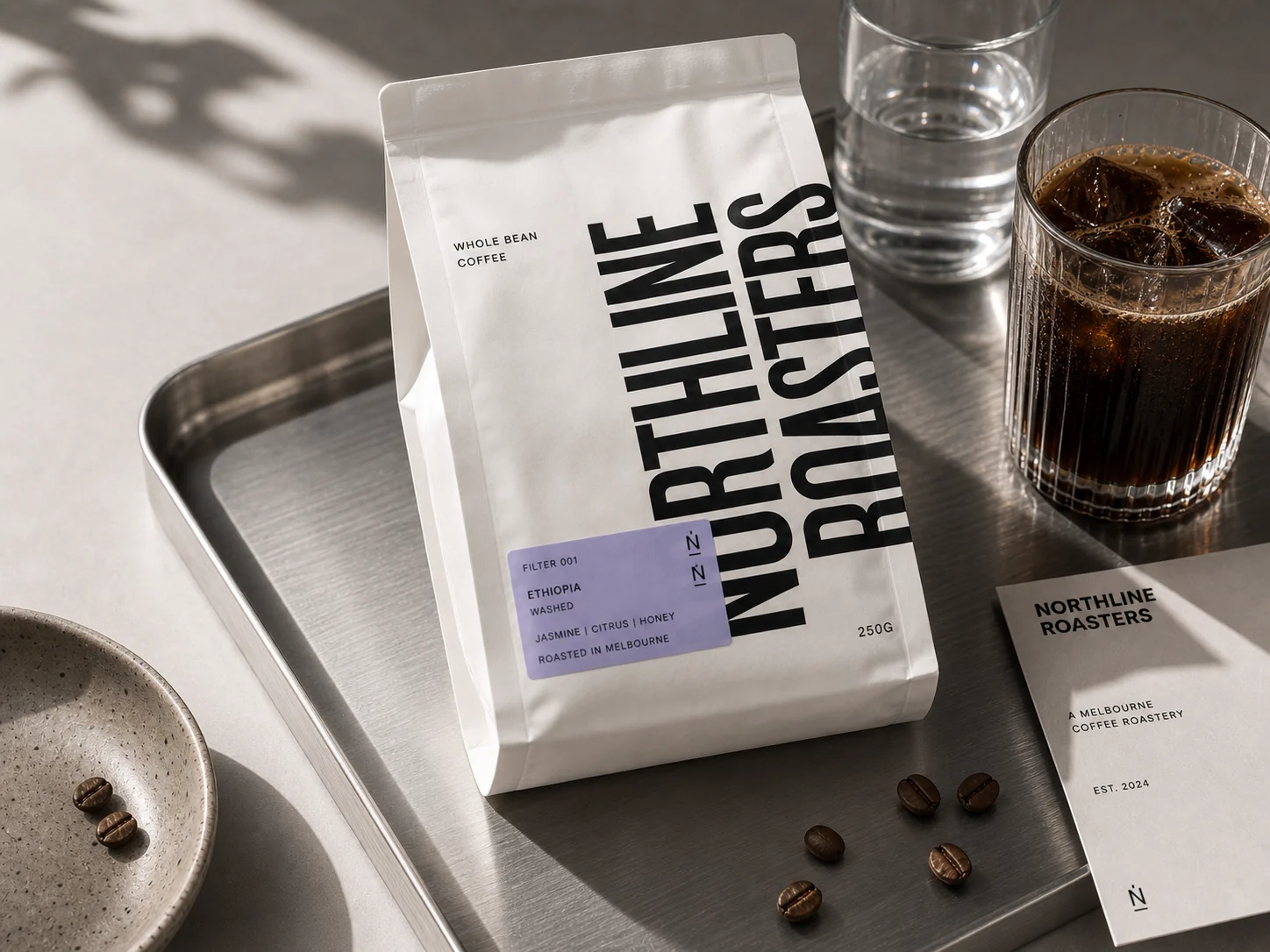
The coffee bag becomes the main brand surface.
The vertical wordmark gives the white bag enough force to work on shelf, while the lavender label keeps origin, process and flavour notes immediately scannable.
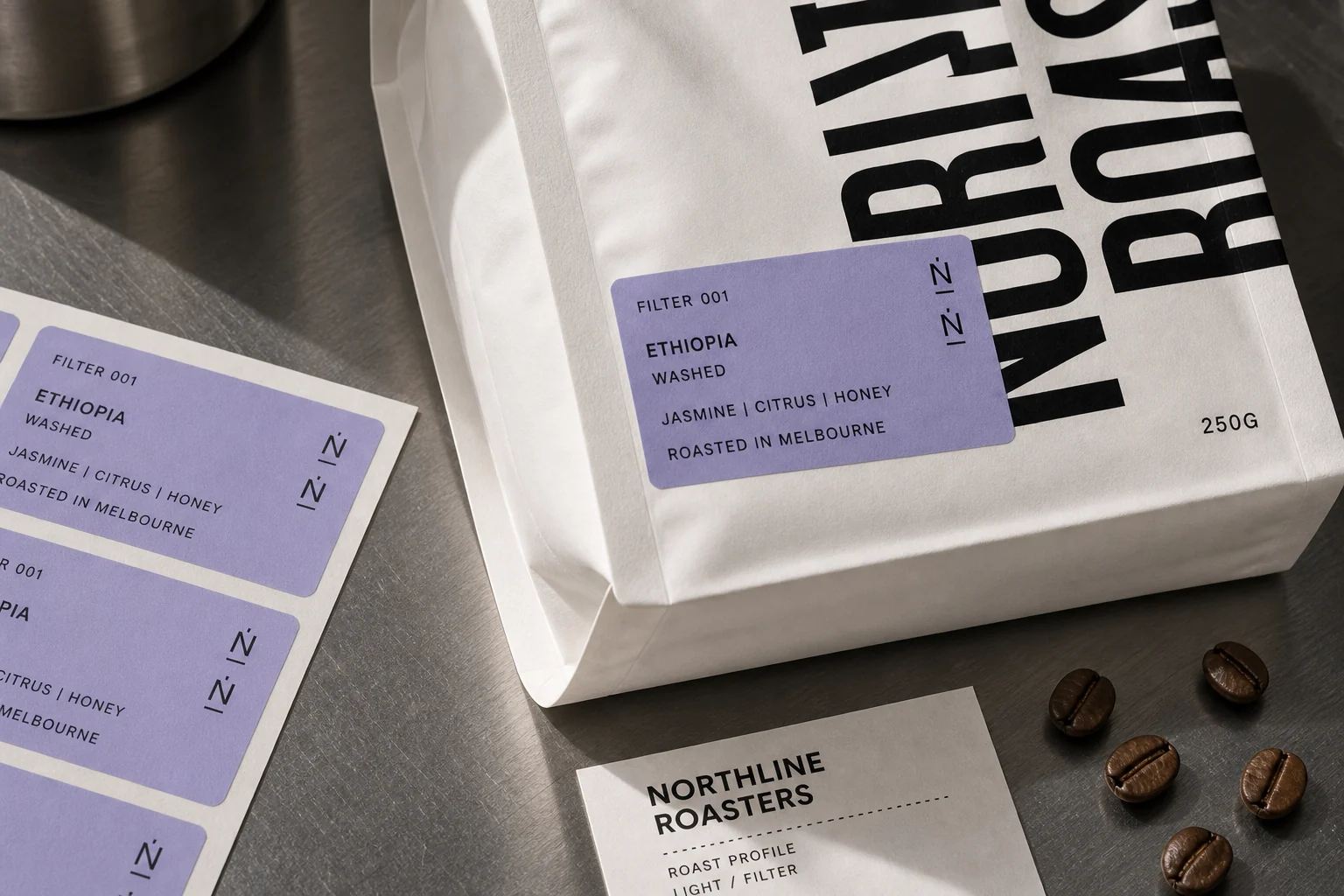
Logo, type and roast logic
A condensed identity with one precise colour signal.
The brand language is intentionally narrow: black wordmark, N/R monogram, condensed type, off-white paper and lavender labels for roast data.
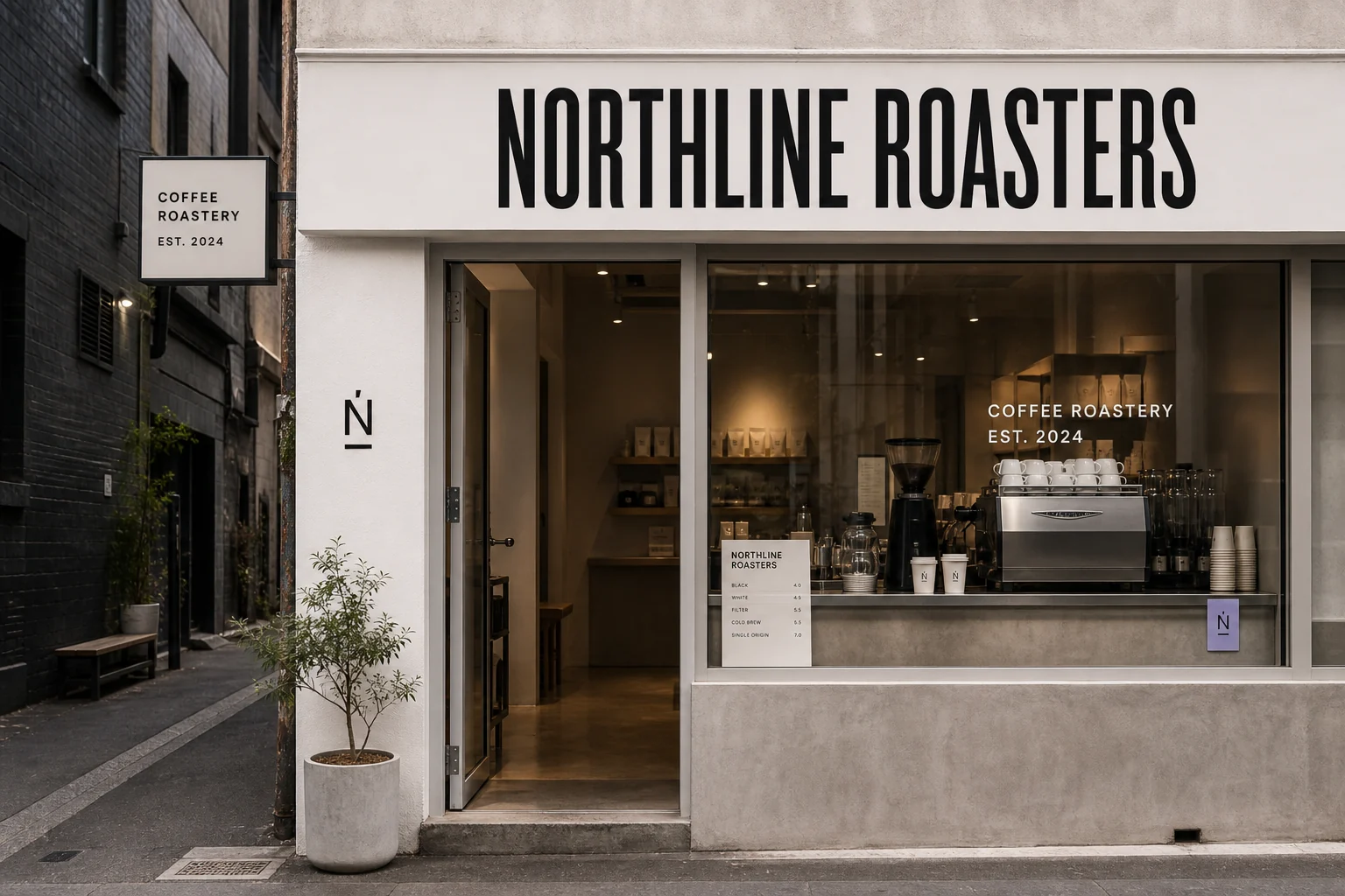
Retail presence
The storefront keeps the same direct, industrial rhythm.
Large compressed signage, a simple side sign and a visible counter menu give the roastery a sharp street presence without adding cafe nostalgia.
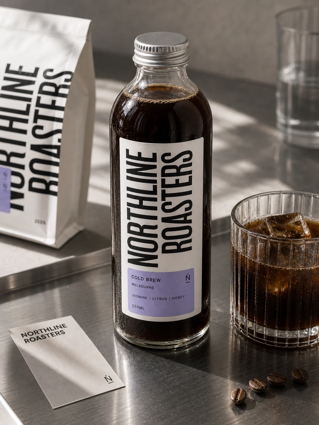
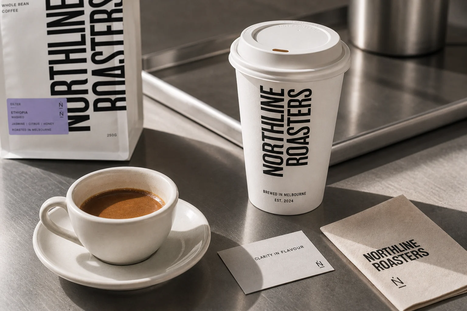
Counter ritual
Hot cup, cold brew and beans stay in one visual line.
The system moves from daily coffee service into bottled cold brew without changing voice. Product hierarchy stays quiet, sharp and practical.
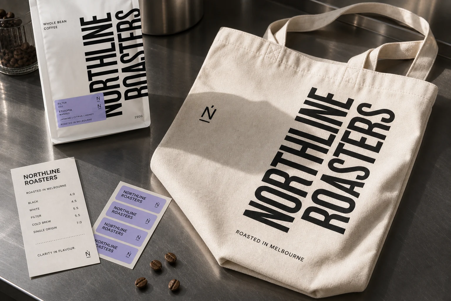
Retail extensions
The system keeps stretching without extra decoration.
Merchandise and subscription packaging use the same ingredients: wordmark scale, simple paper, lavender information cards and stainless counter photography.
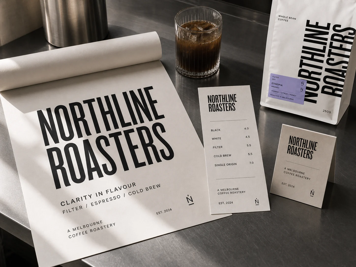
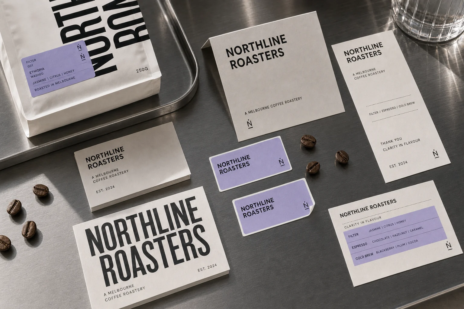
Menu and poster communication
The brand can still carry real counter information.
Price lists, roast profiles, poster copy and thank-you cards are treated as part of the identity, not as afterthoughts.
Why this belongs in Featured Projects
Northline adds a colder, more precise food retail system to the portfolio.
Start a similar project
Need a retail identity that works from shelf to counter?
Use this route when your brand needs packaging logic, menu communication, retail signage and launch-ready applications working as one system.