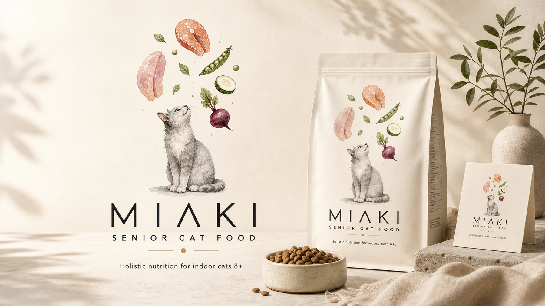
Miaki
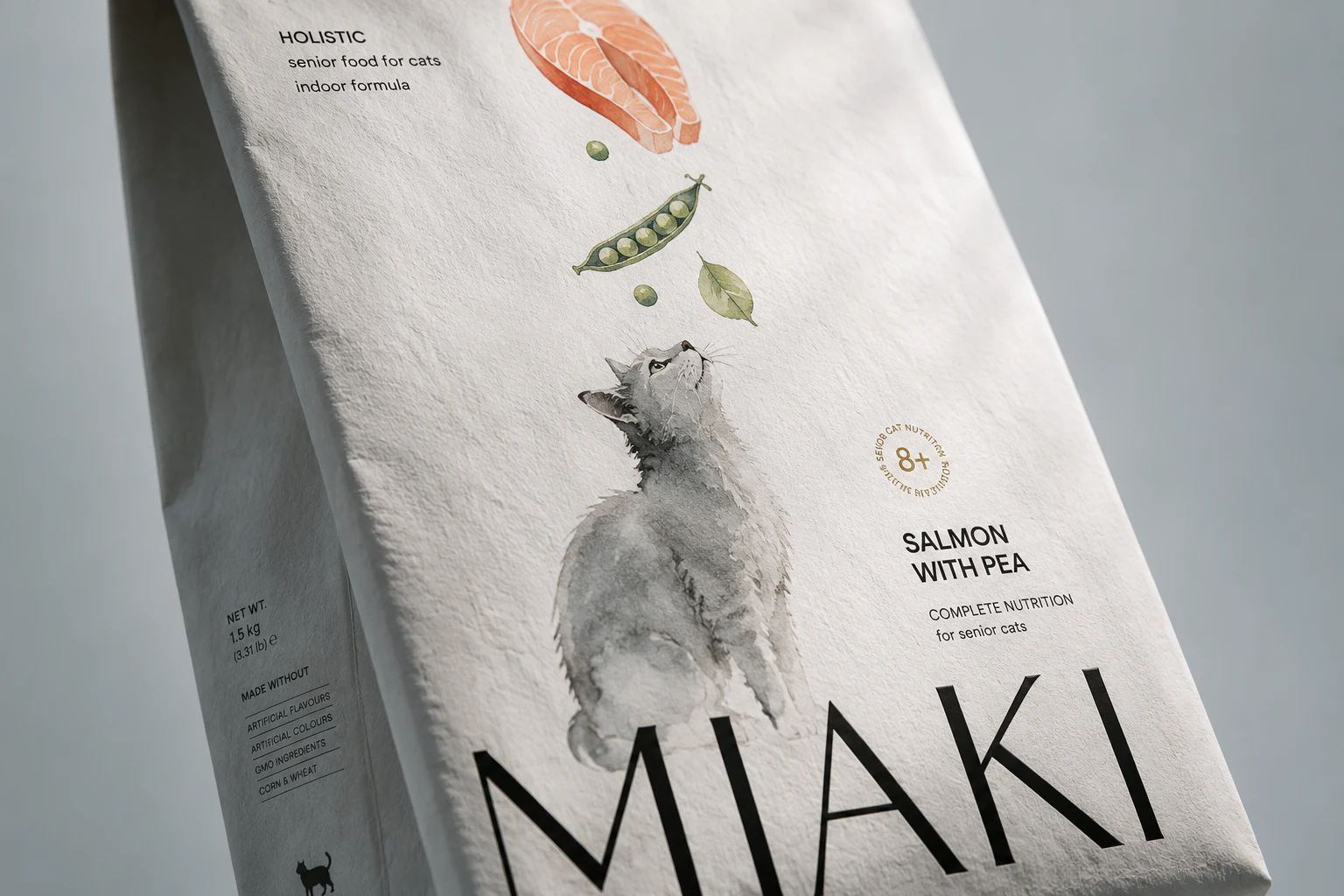
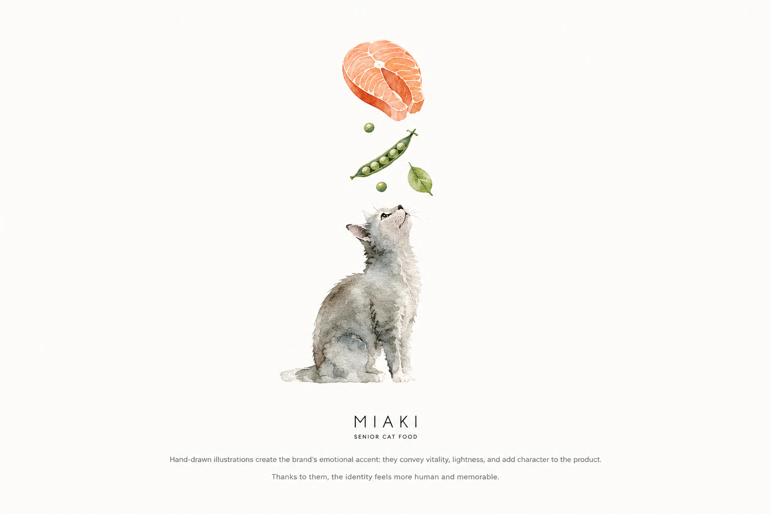
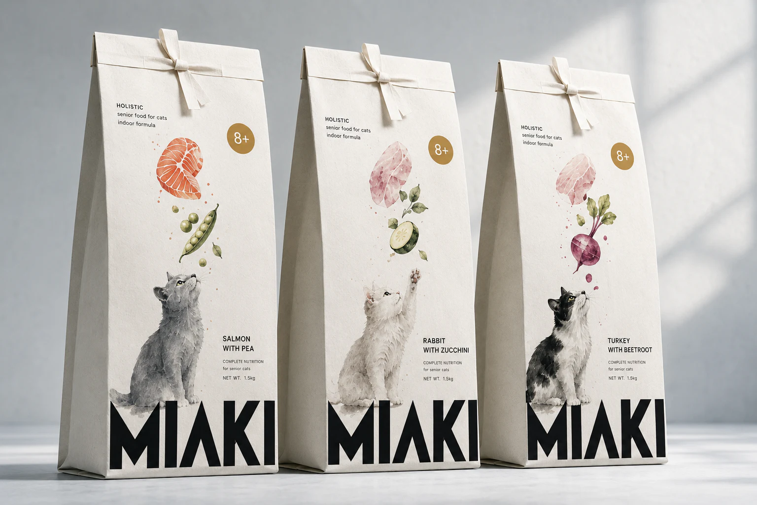
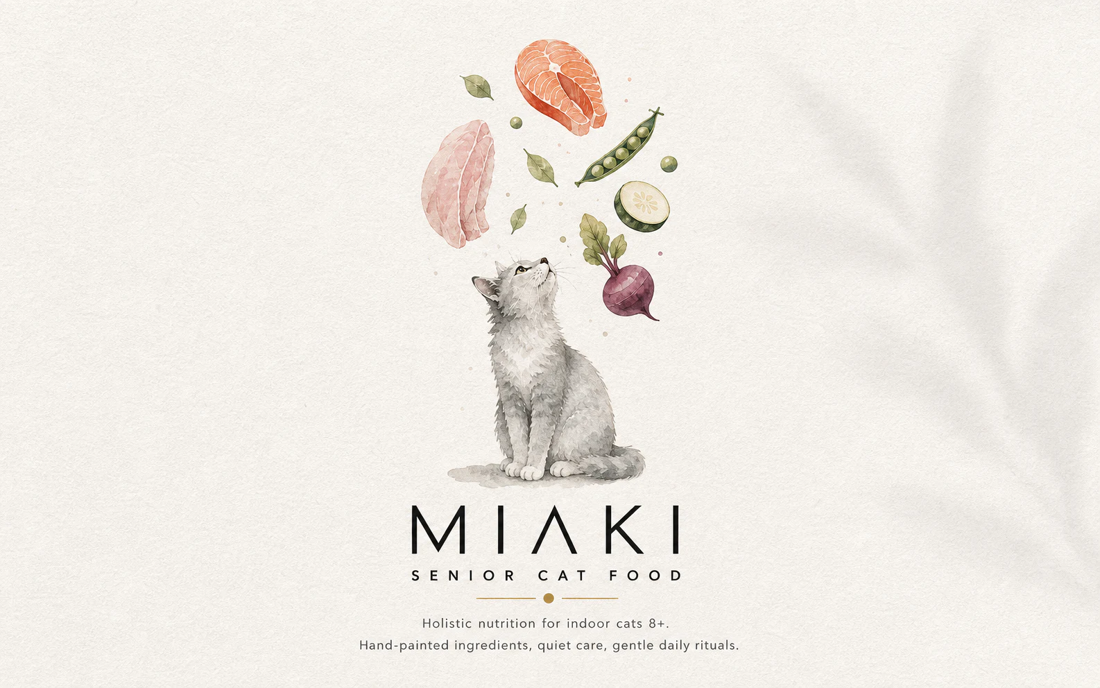
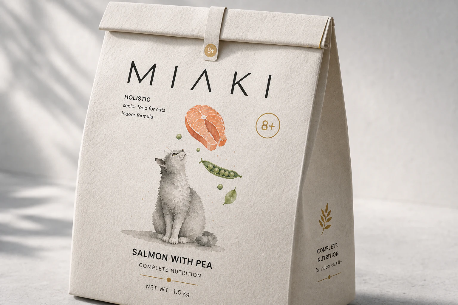
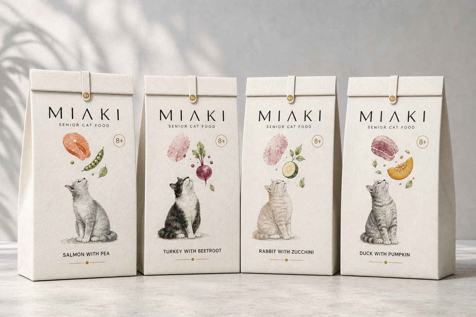
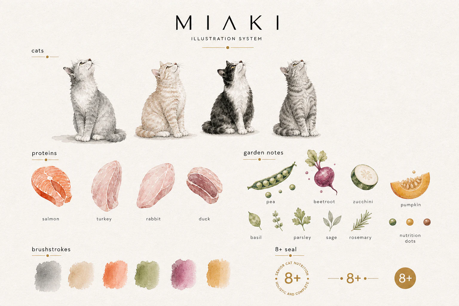
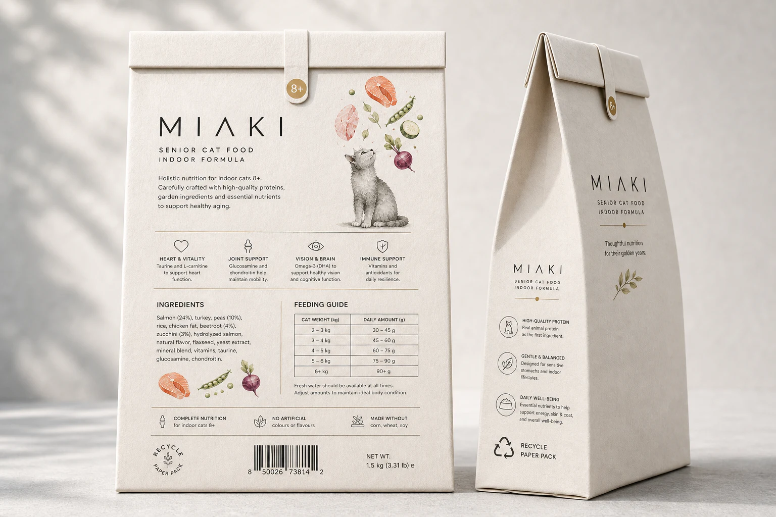
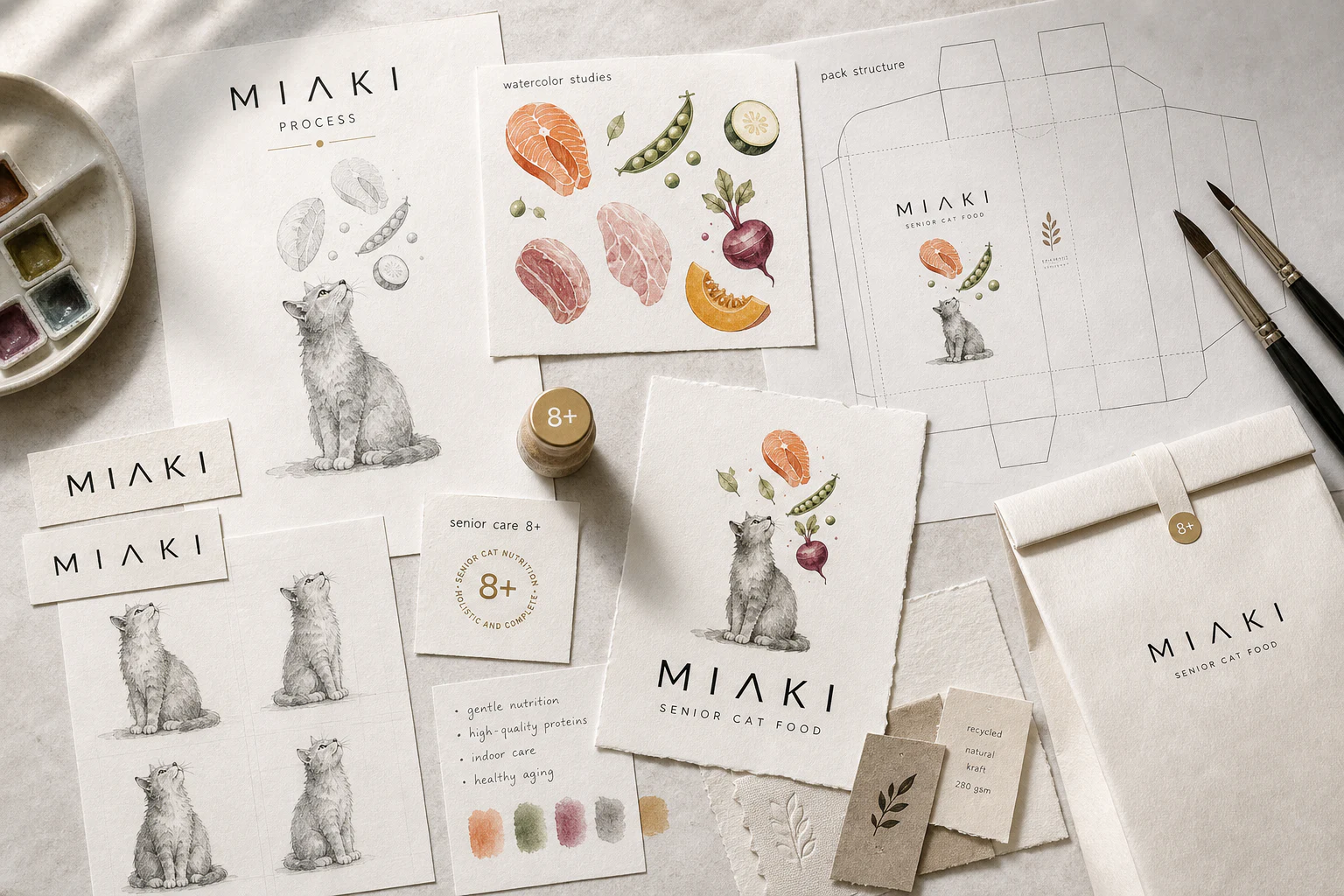
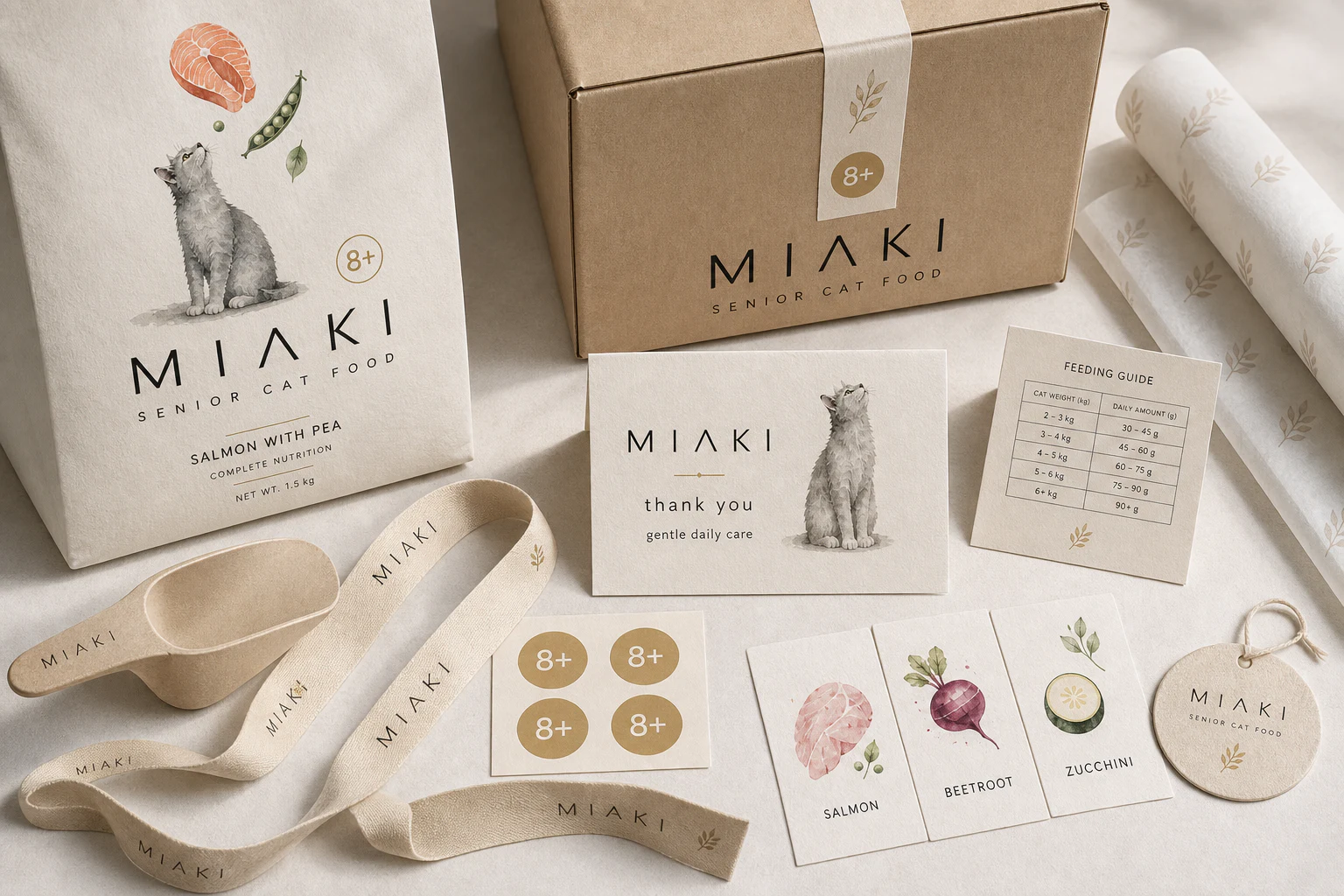
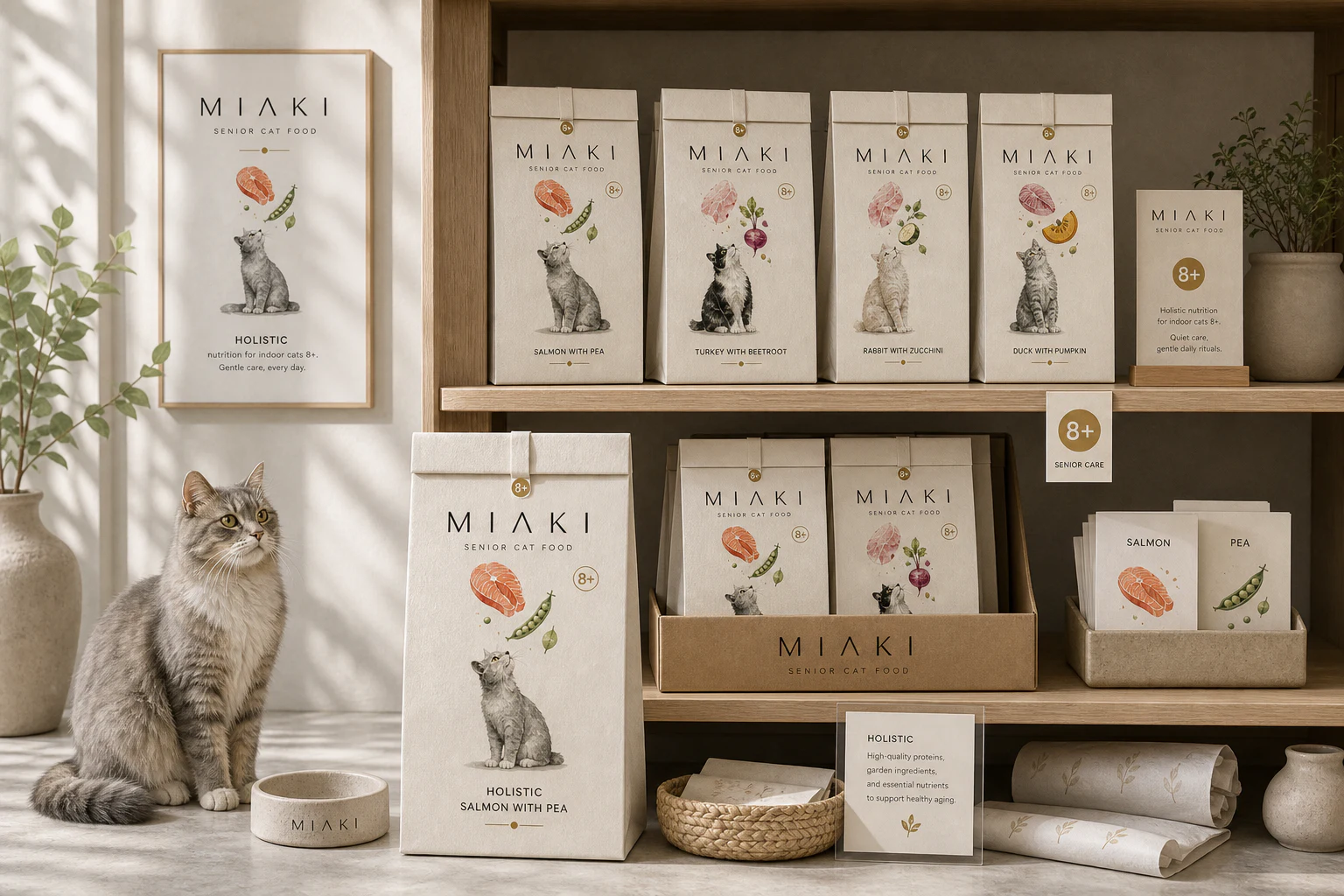
A food packaging world built with illustration, labels and retail-ready applications.
Start a project
Need a system with this level of finish?
Compare fixed-scope packages in AUD, or email YL Studio with Miaki as a reference.
A food packaging world built with illustration, labels and retail-ready applications.
Start a project
Compare fixed-scope packages in AUD, or email YL Studio with Miaki as a reference.