Skincare identity / Clinical retail system
Science-led beauty with a sharper retail pulse.
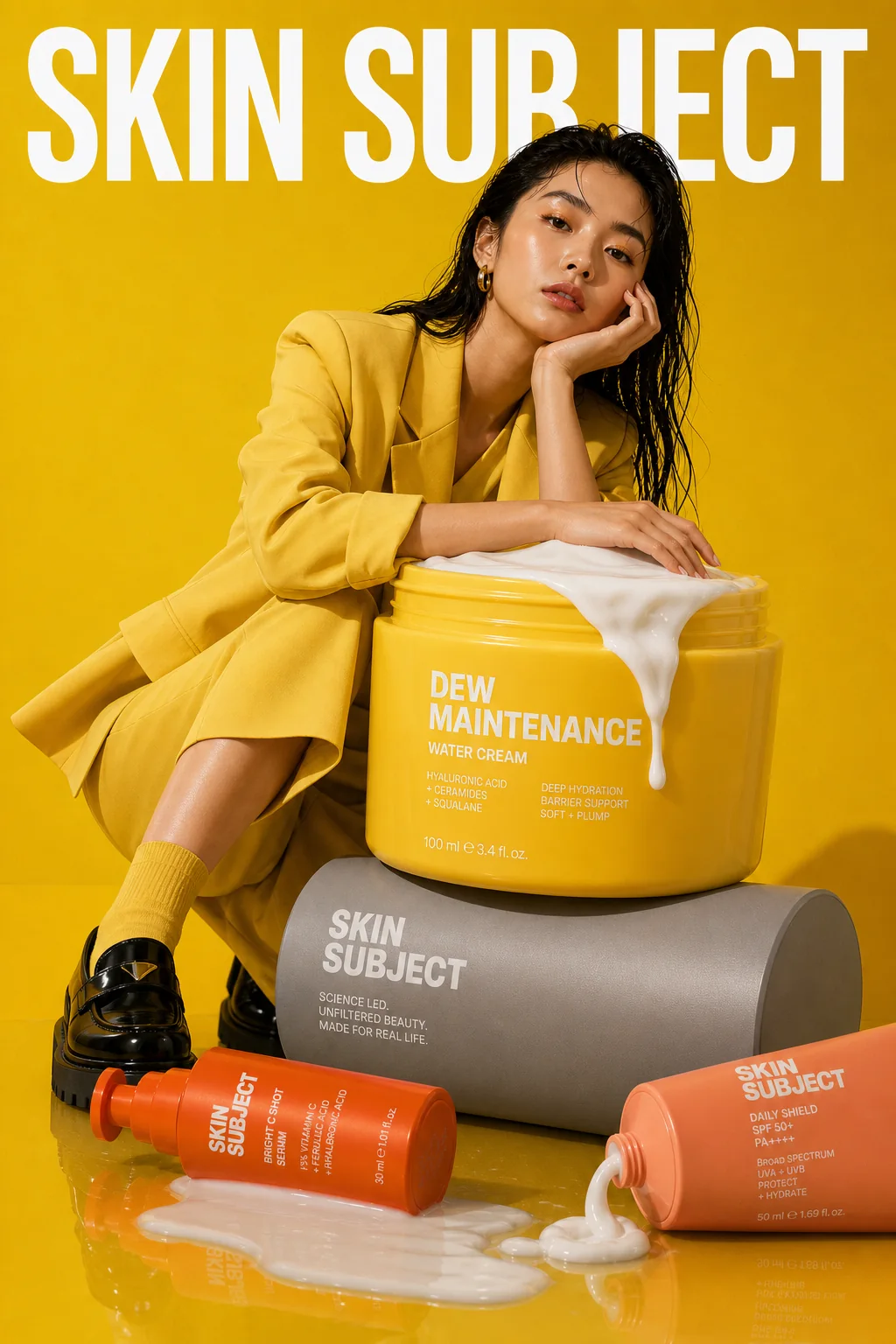
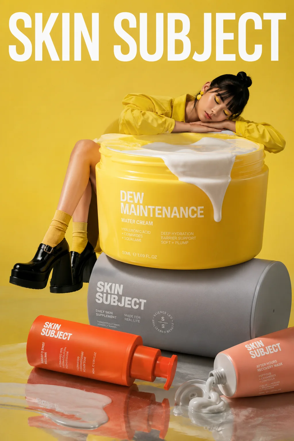
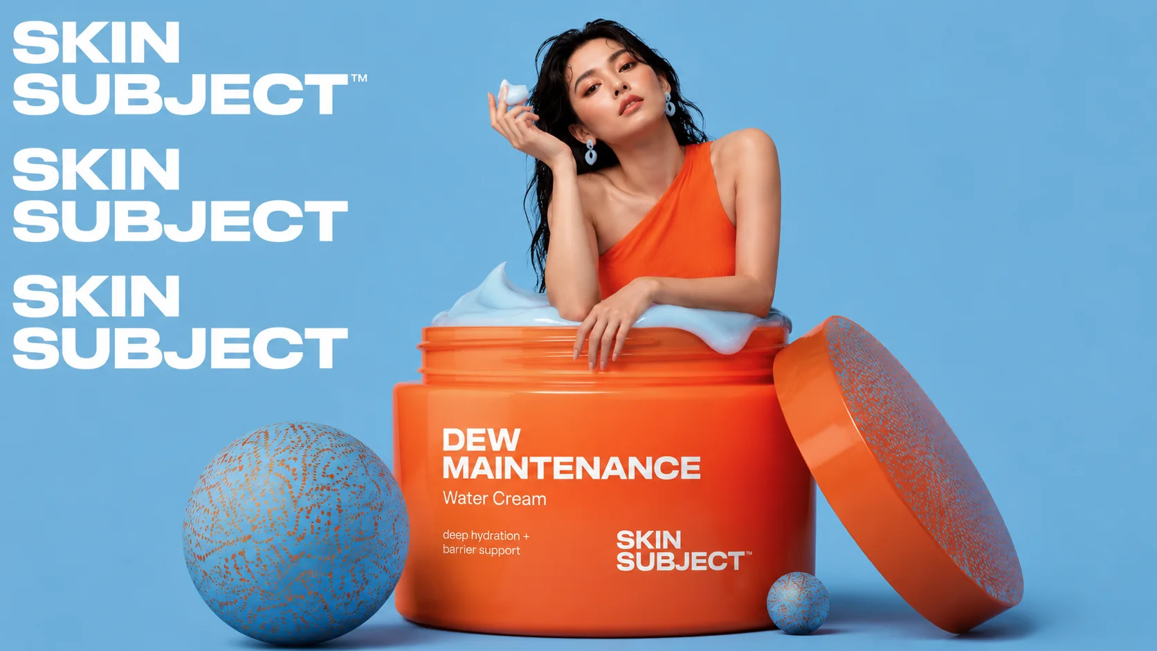
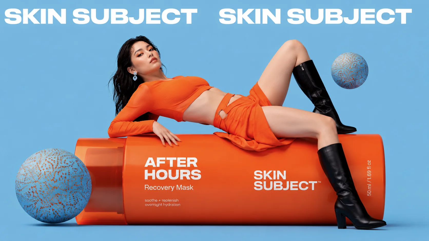
SKIN SUBJECT is a fictional skincare identity for products that need to feel credible, modern and easy to decode. The direction keeps the lab language visible but uses orange, yellow and sky-blue campaign moments to avoid a sterile cosmetic world.
The system is built around a bold wordmark, product cards, routine colour cues, ingredient education and product photography that can move from shelf to web to outdoor media.
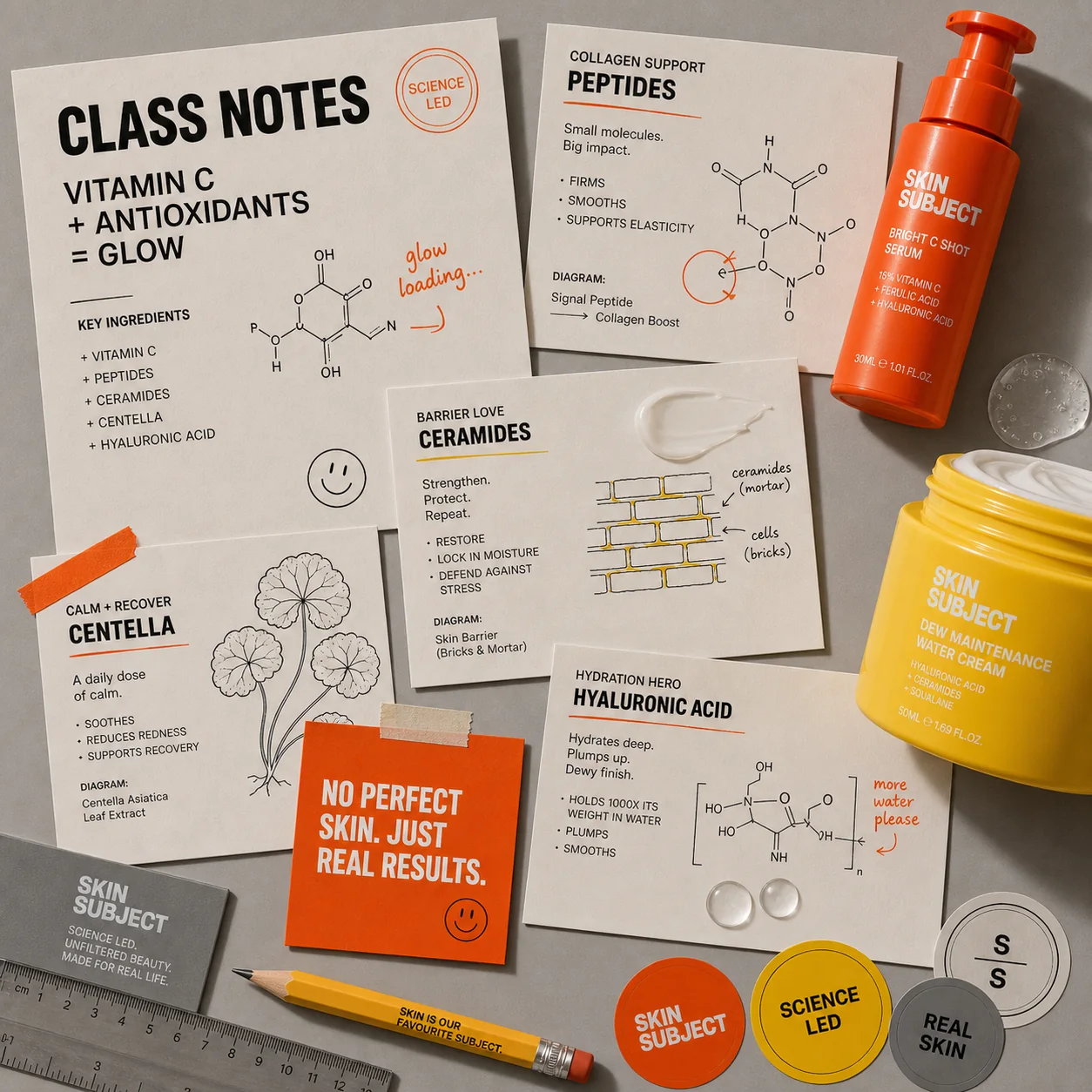
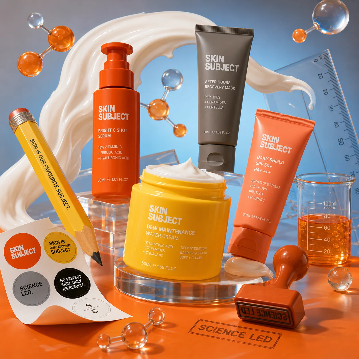
Logo, science and ingredient language
The identity is loud, but the information stays precise.
Large type creates recognition fast. Ingredient notes, class-card layouts and product labels keep the system useful for formulas, routines and retail education.
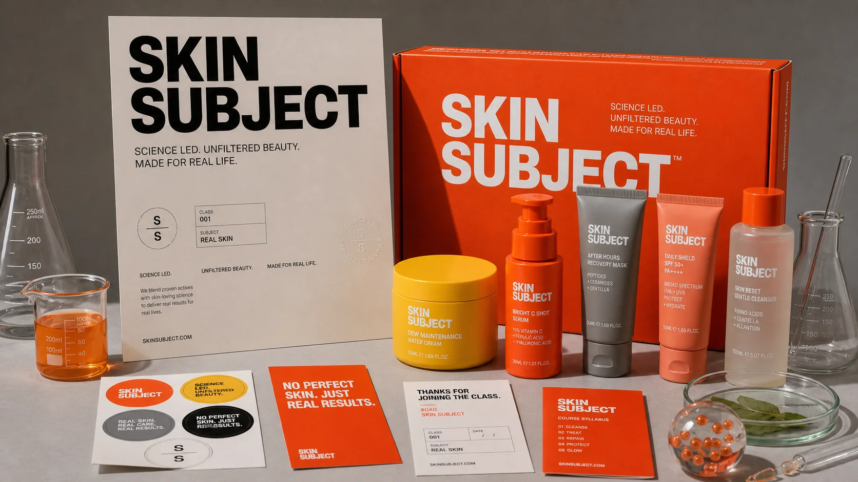
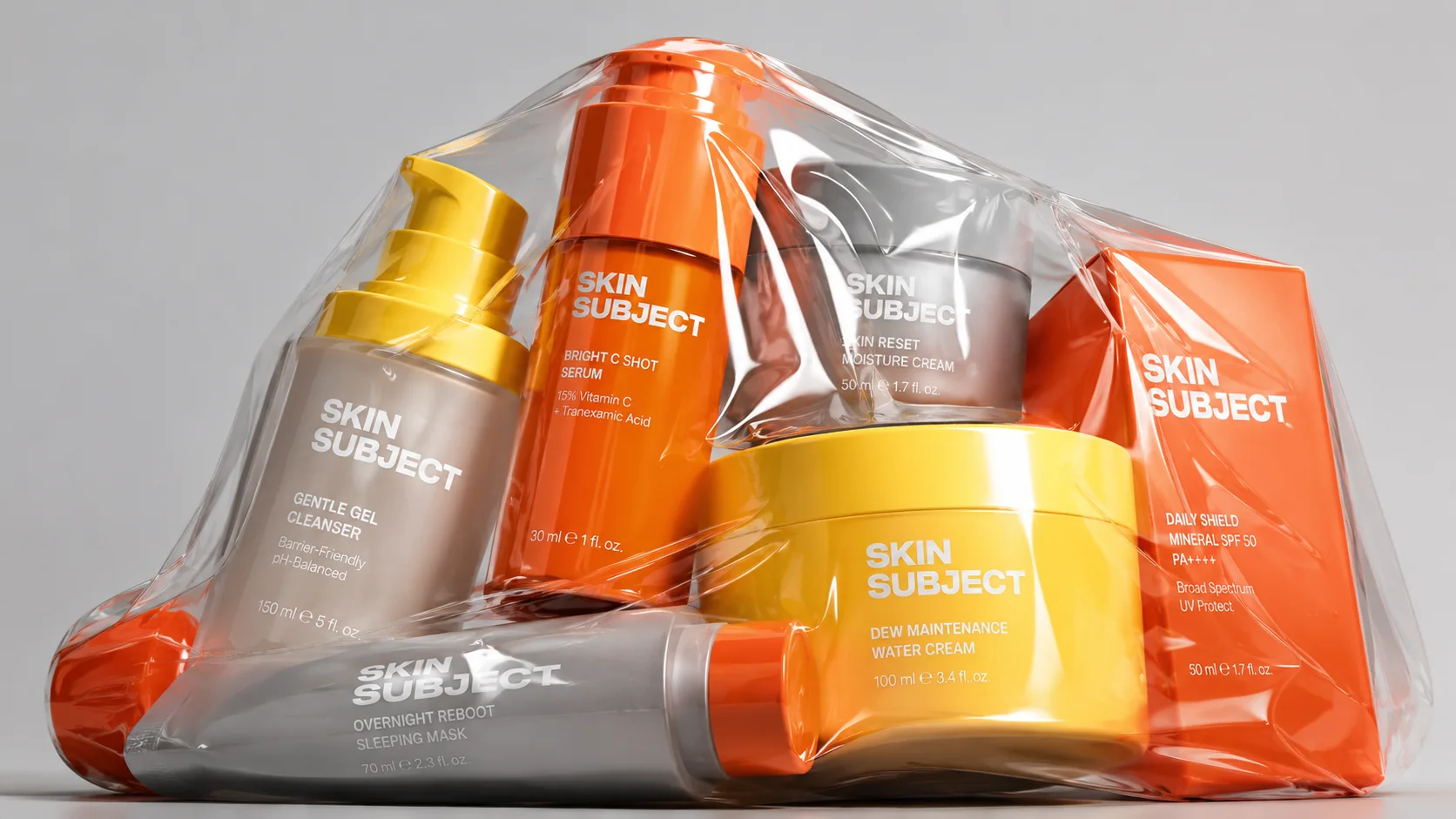
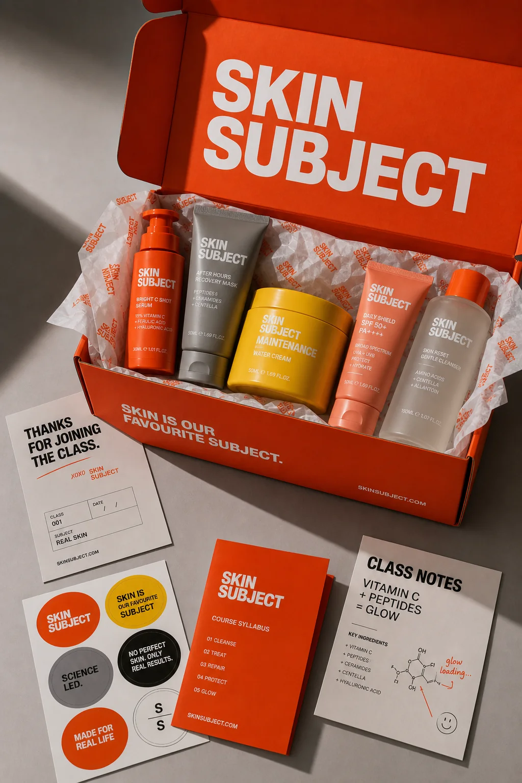
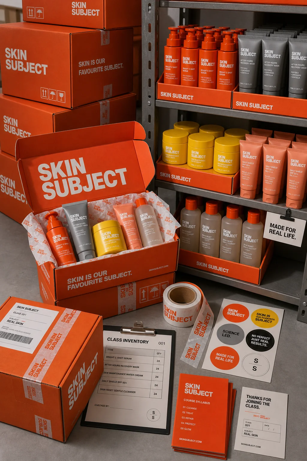
Packaging and retail environment
Every touchpoint keeps the subject in focus.
Unboxing cards, stockroom shelves and product worlds all repeat the same high-contrast orange signal, clinical grey base and yellow routine cue.
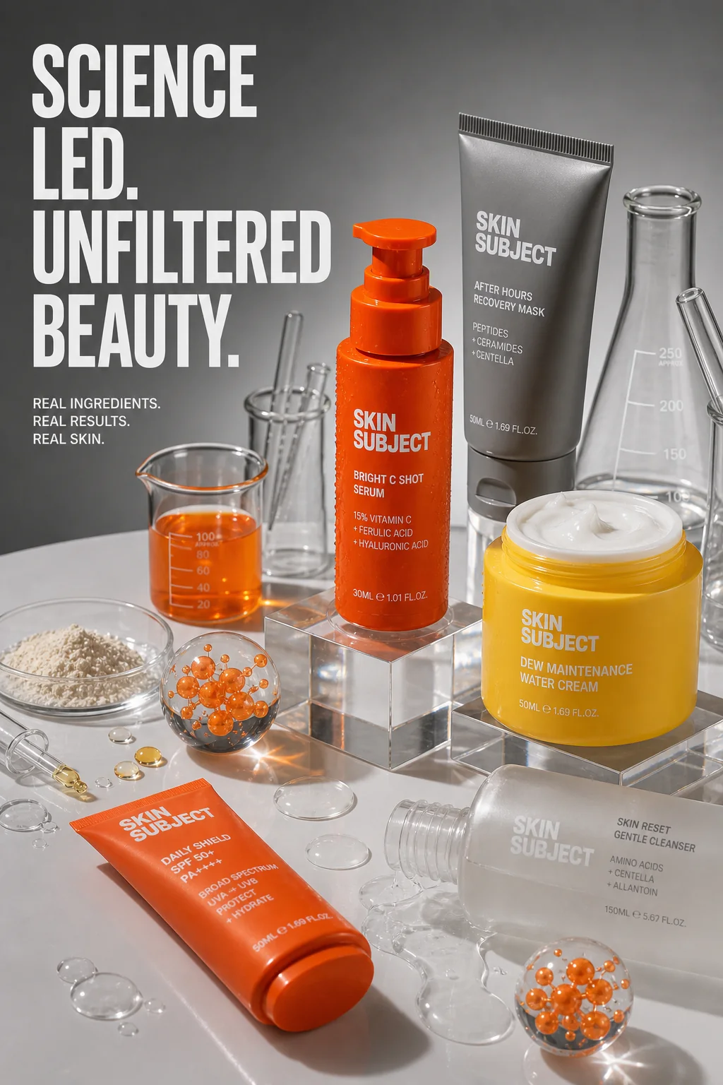
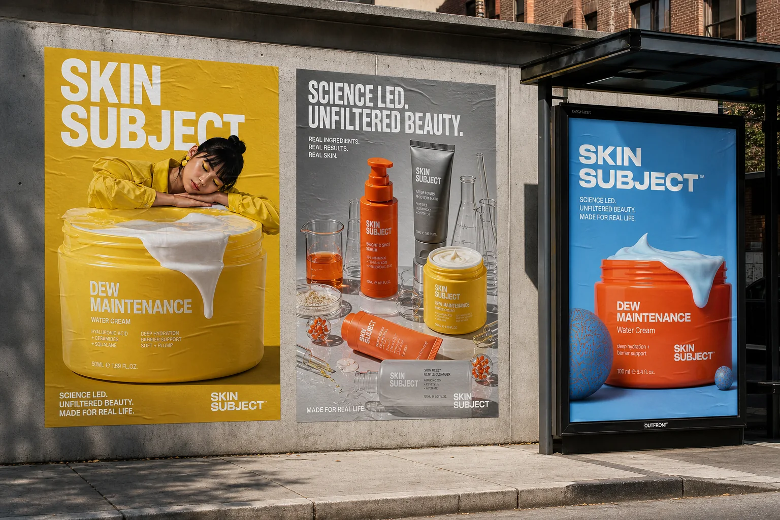
Campaign and launch imagery
The campaign turns product education into graphic energy.
The outdoor and social scenes keep the product large, the benefit language direct and the colour system instantly recognisable.
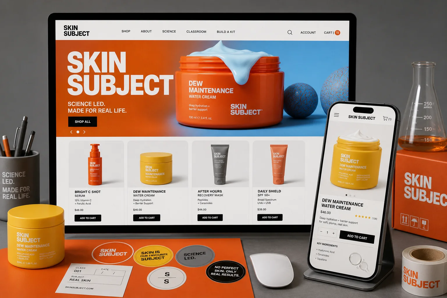
E-commerce and conversion surface
The system stays legible when it becomes a shop.
Product cards, benefit labels and campaign visuals translate into a web direction that can guide browsing, routine building and product comparison.
Why this belongs in Featured Projects
SKIN SUBJECT adds beauty proof without narrowing YL to beauty only.
Start a similar project