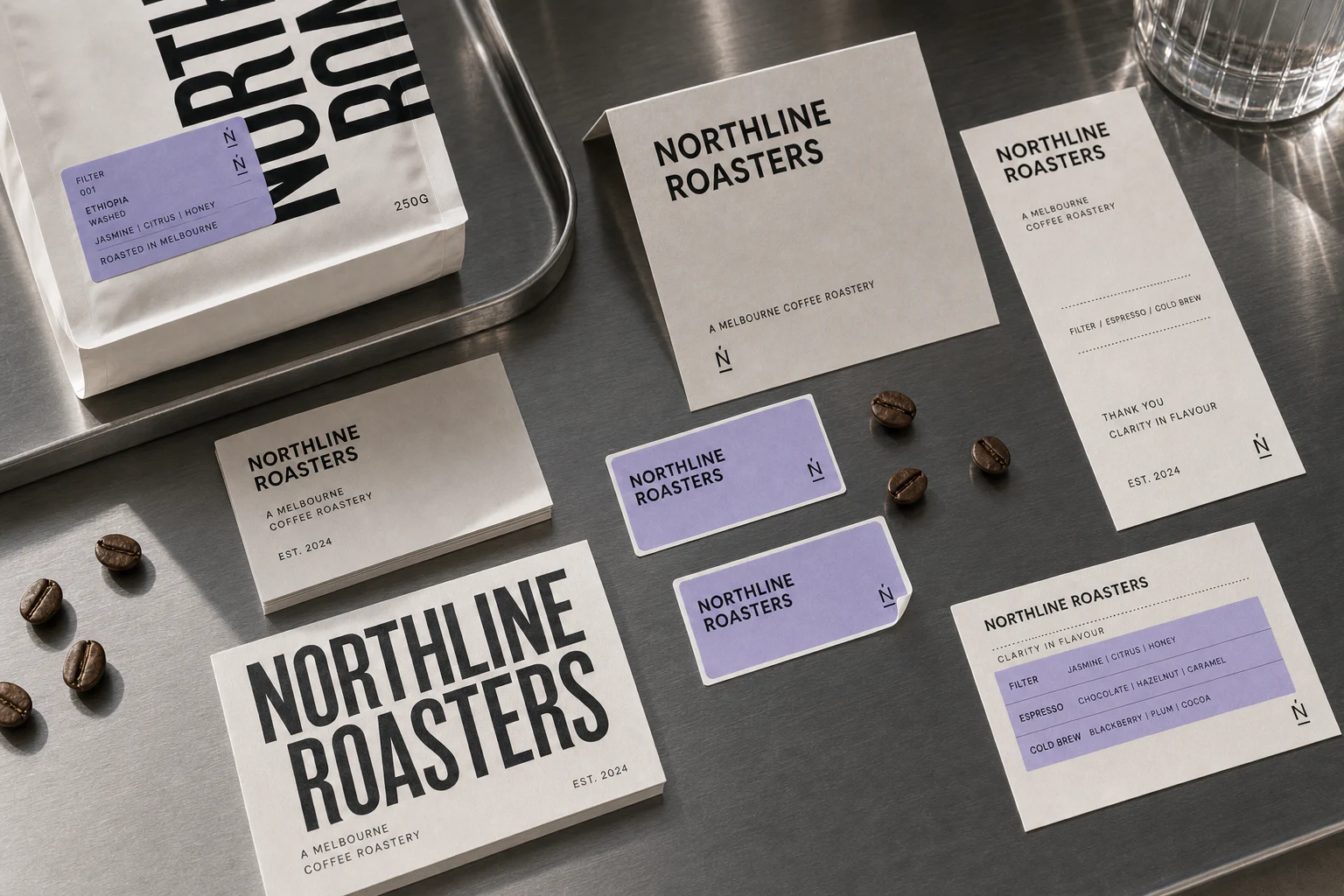
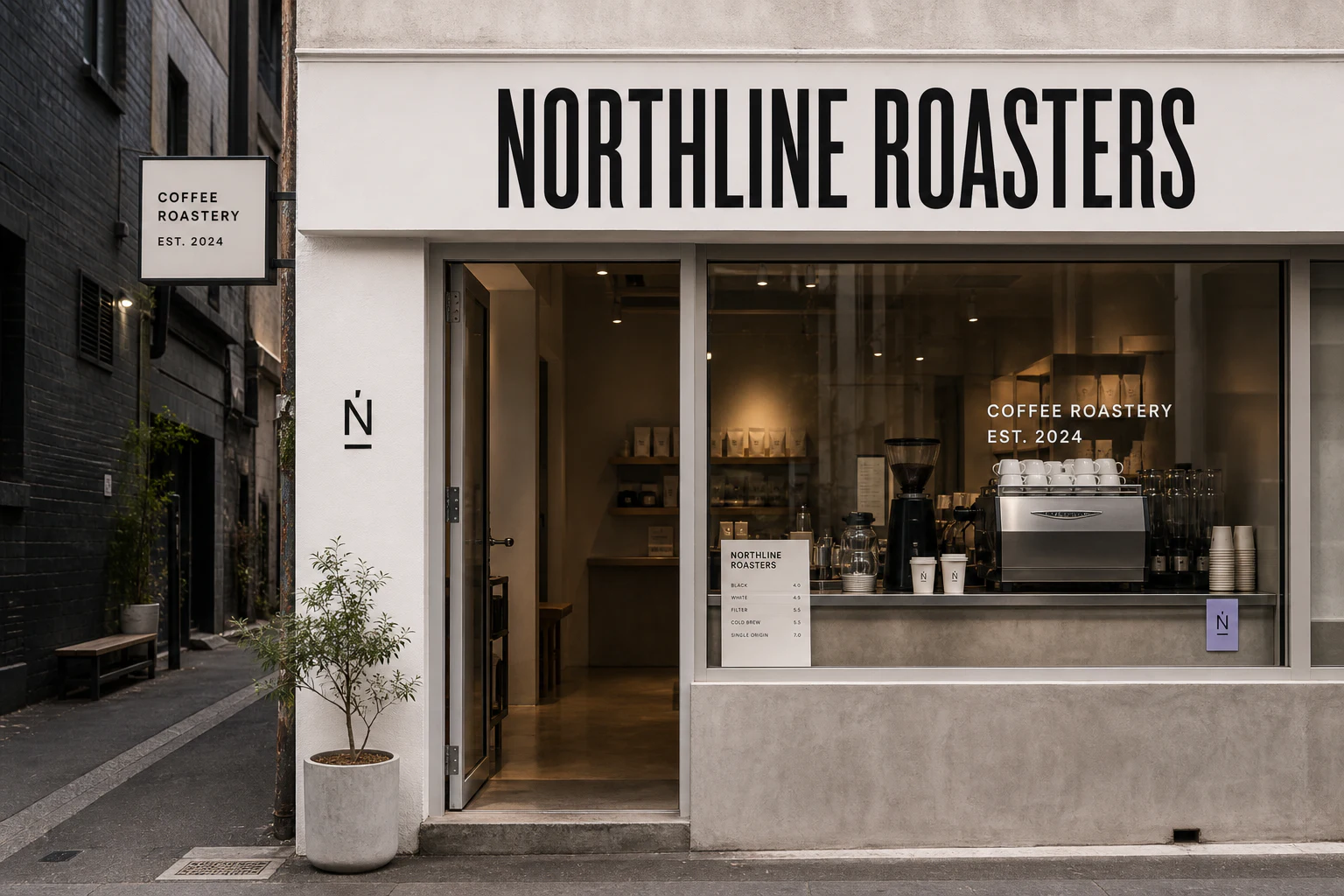
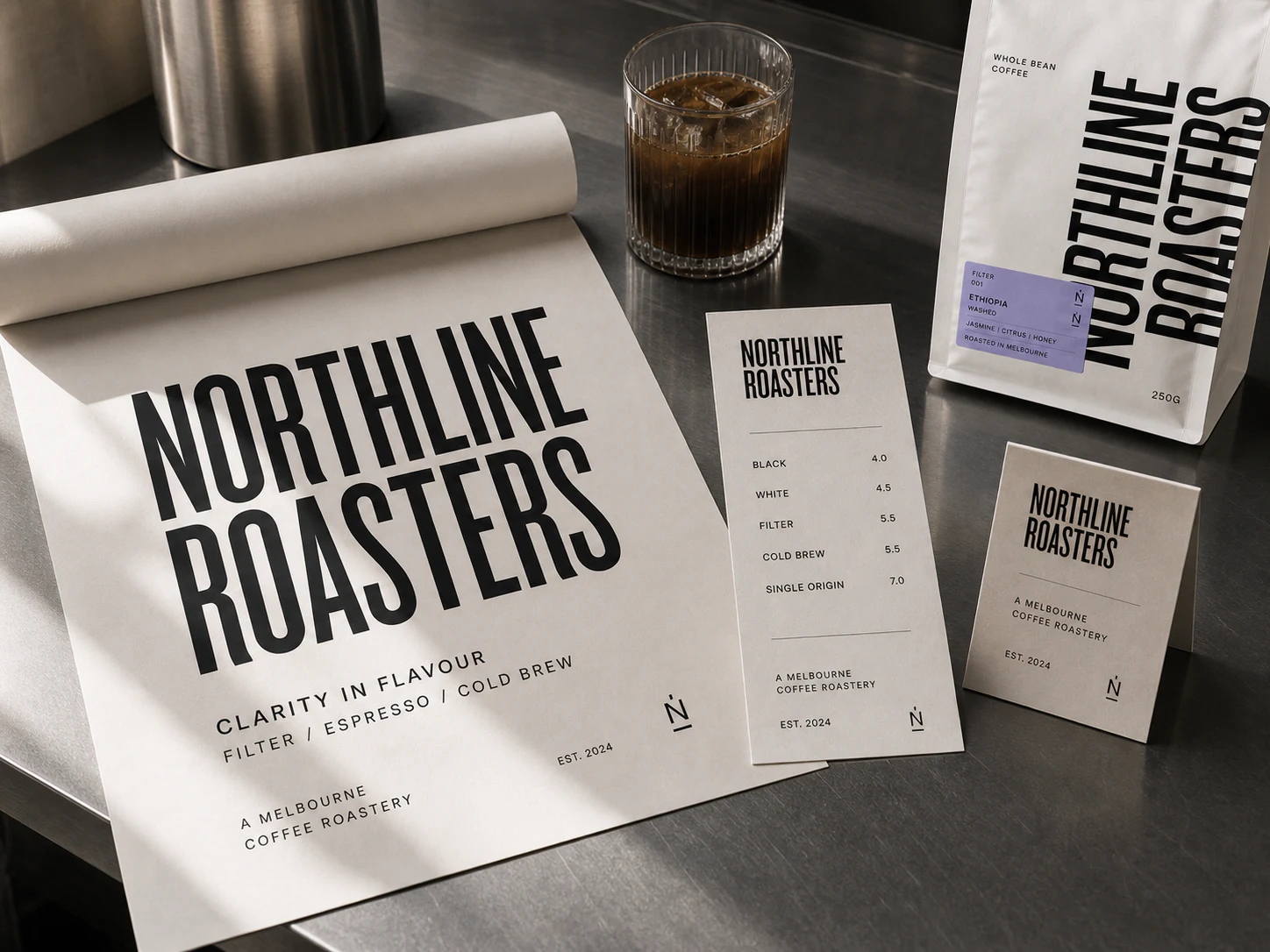
ChallengeNorthline needed to feel established from day one while staying useful across coffee packaging, menus, signage and everyday retail moments.
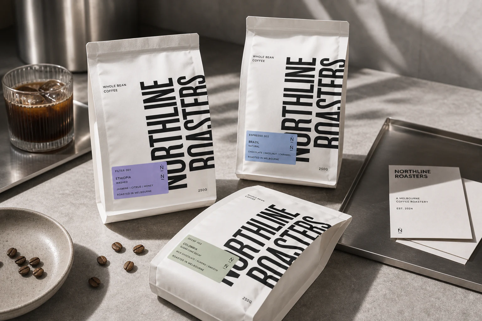
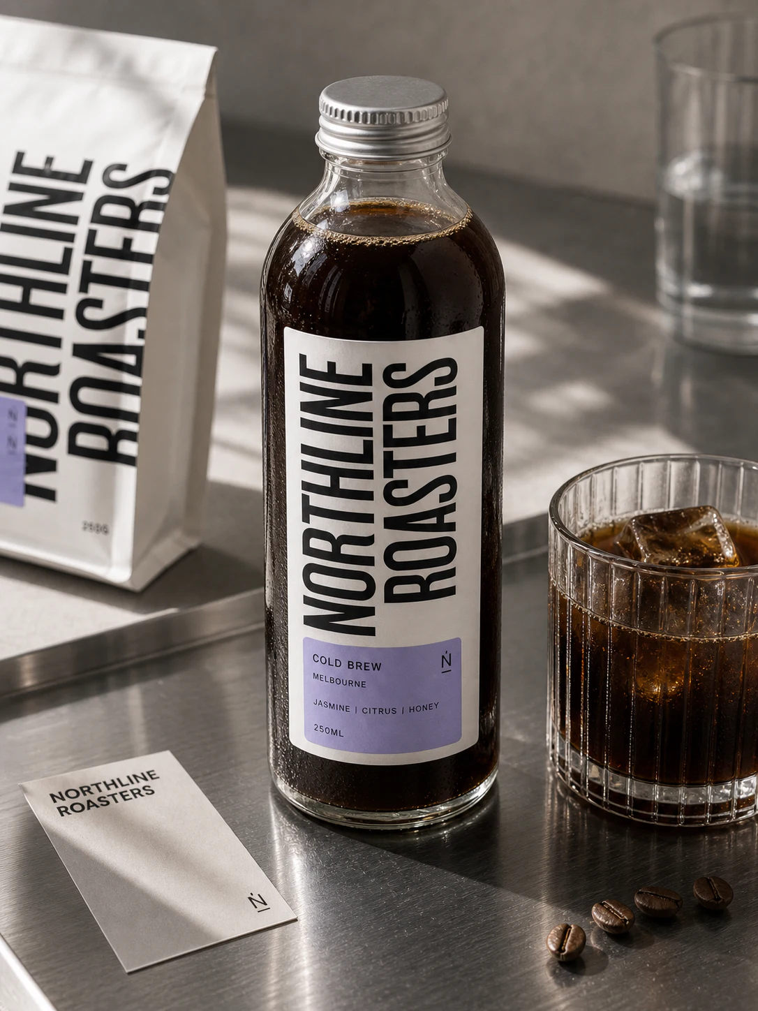
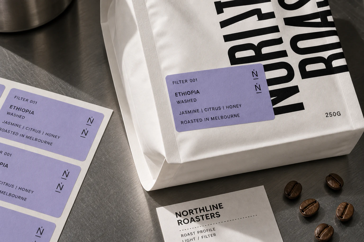
StrategyThe direction balances an industrial roastery attitude with a clear product hierarchy, giving each blend a confident place inside one recognisable family.
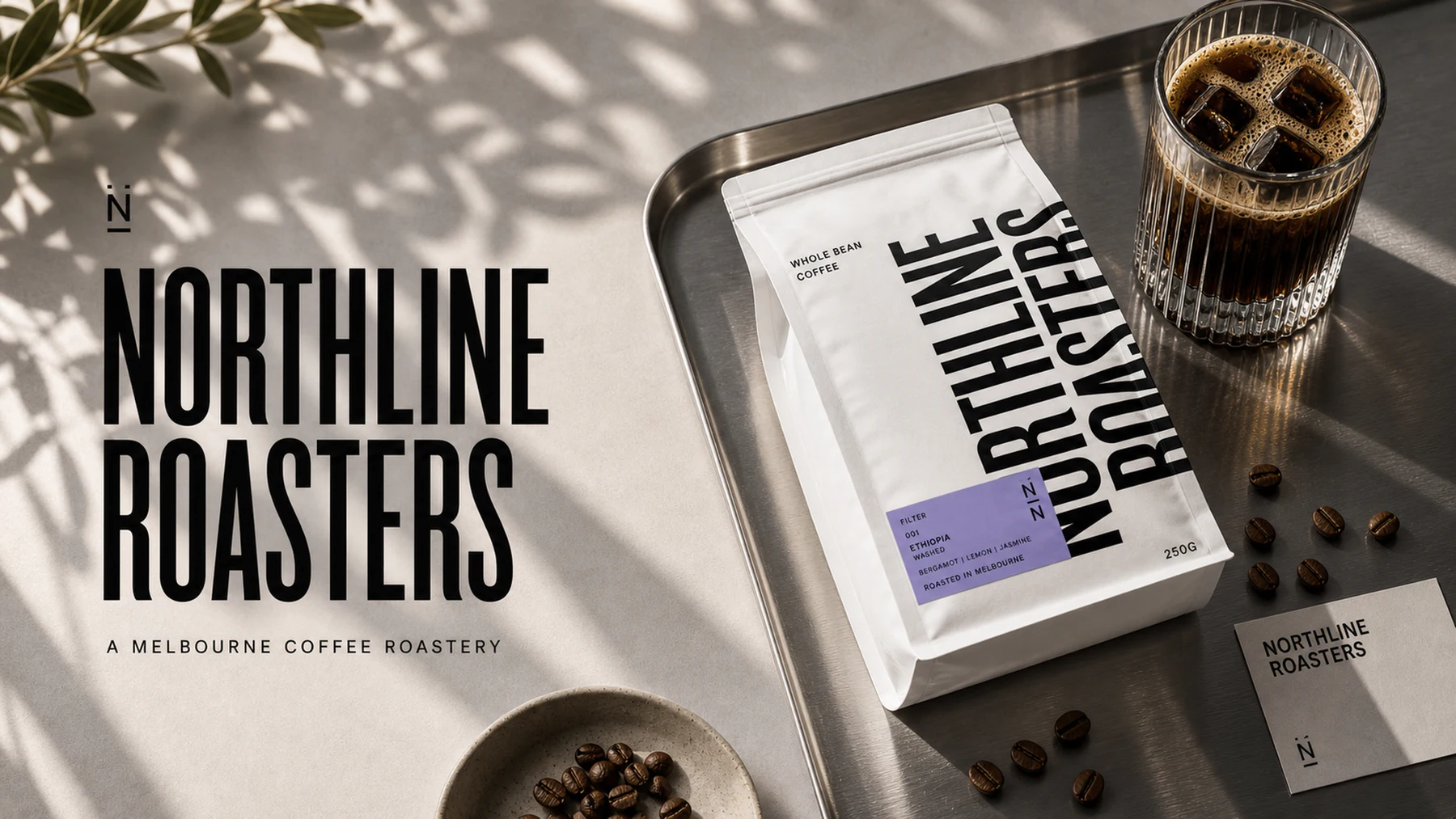
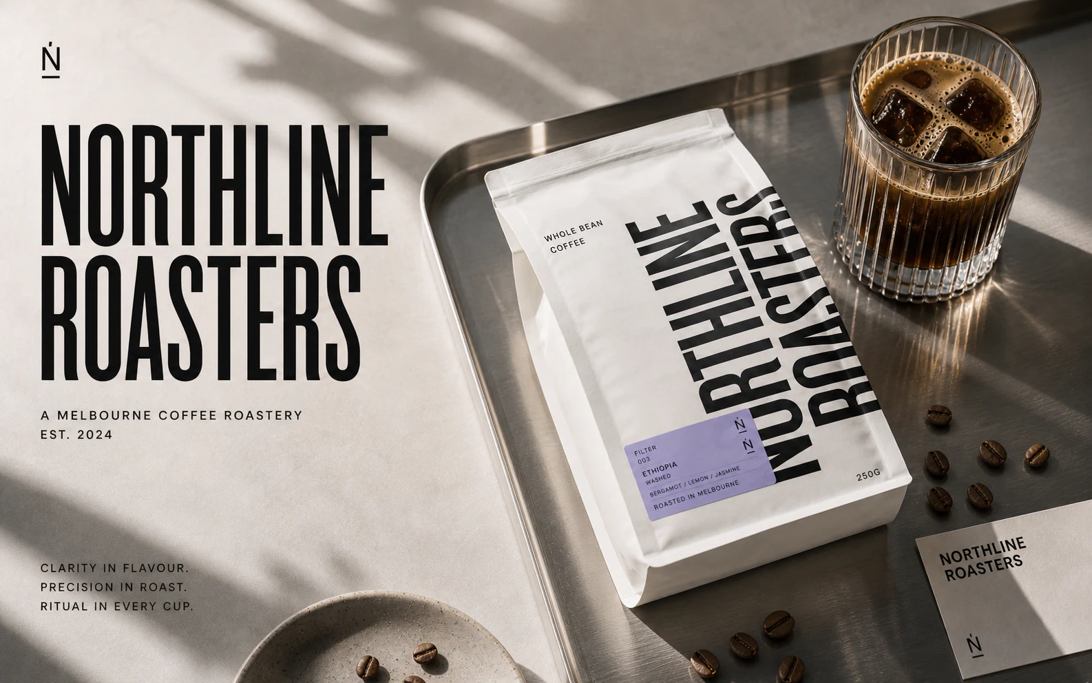
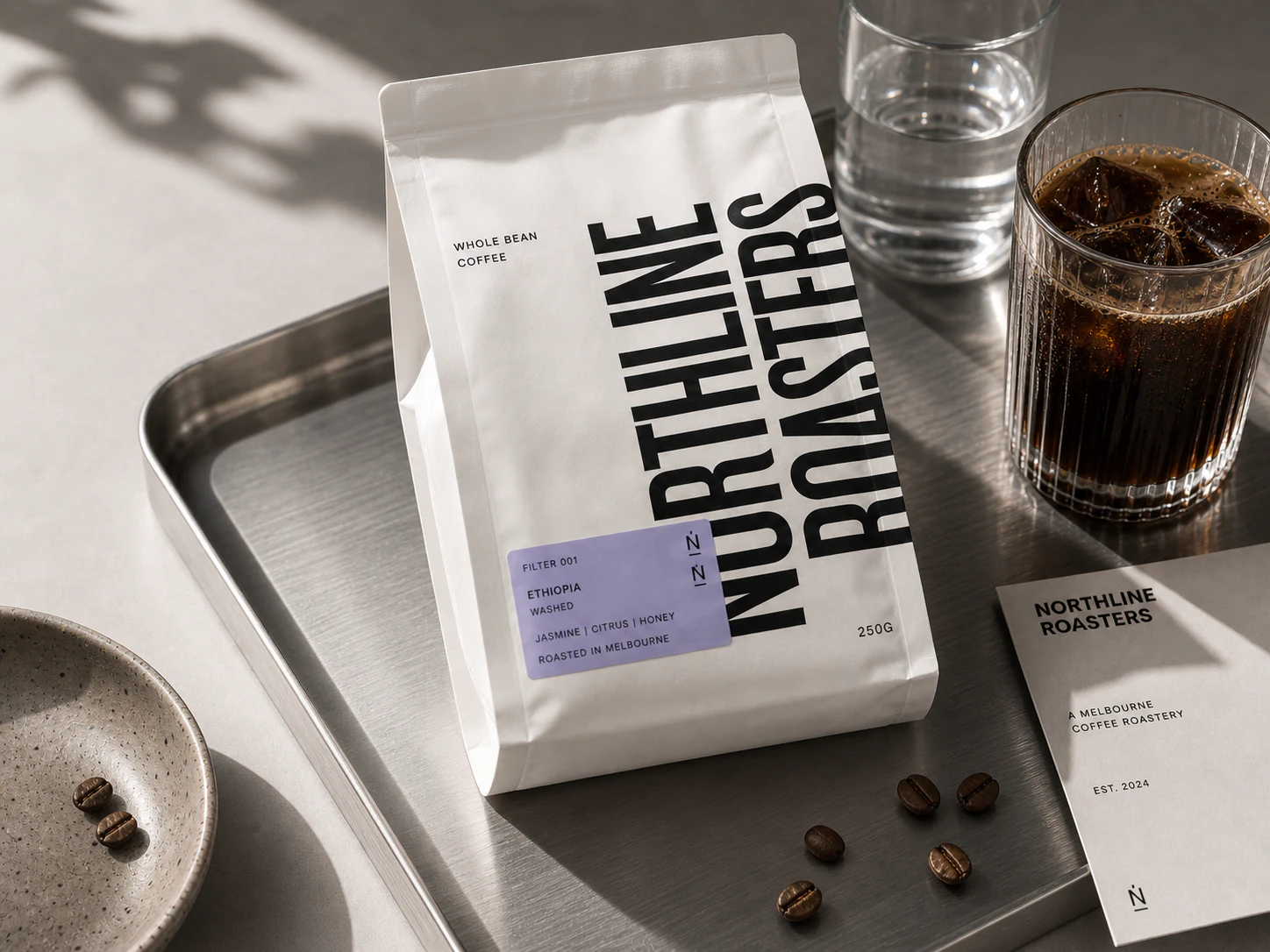
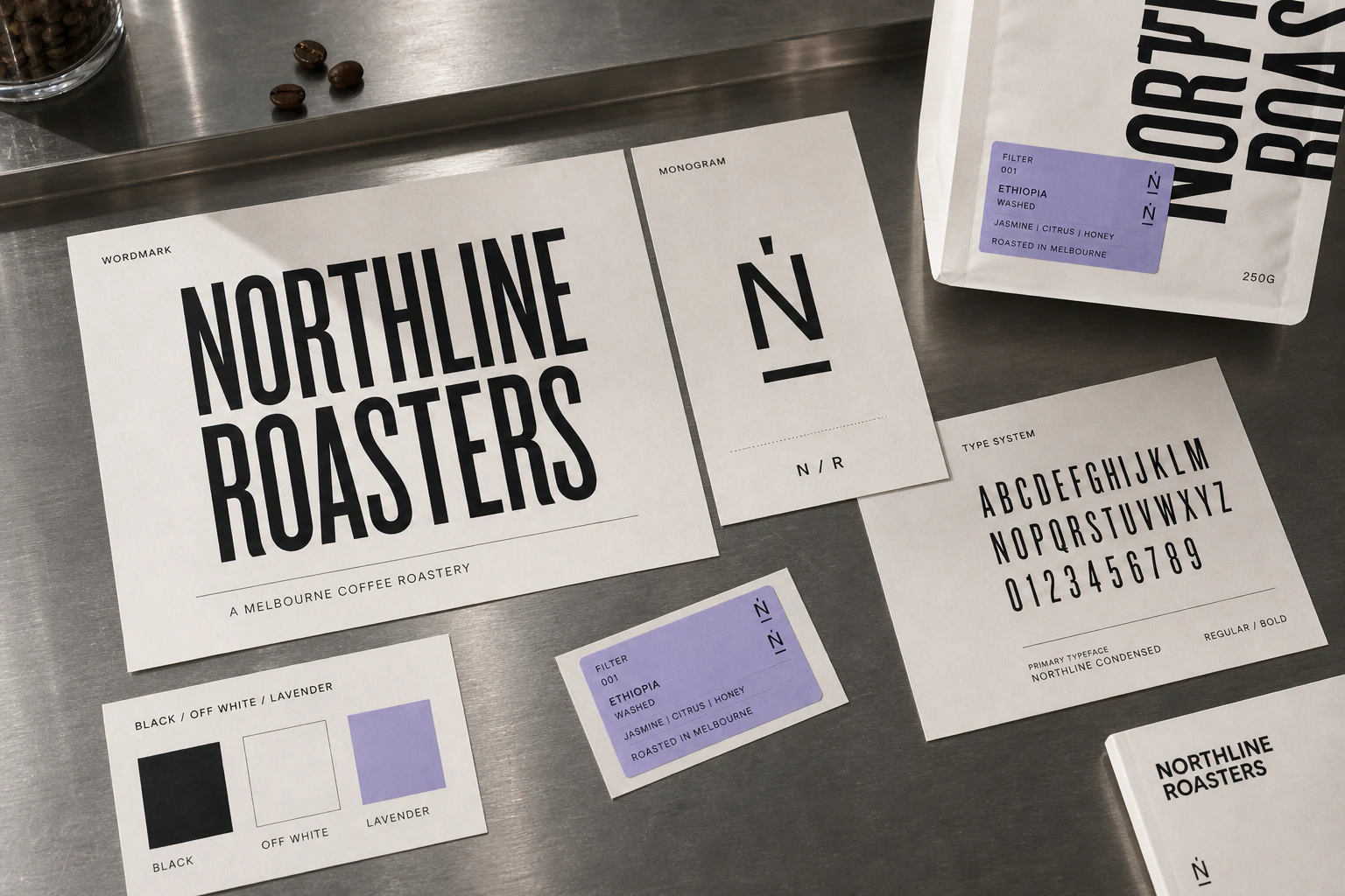
IdentityCompressed typography, a compact monogram and a restrained neutral palette create a system that feels direct, contemporary and easy to reproduce.
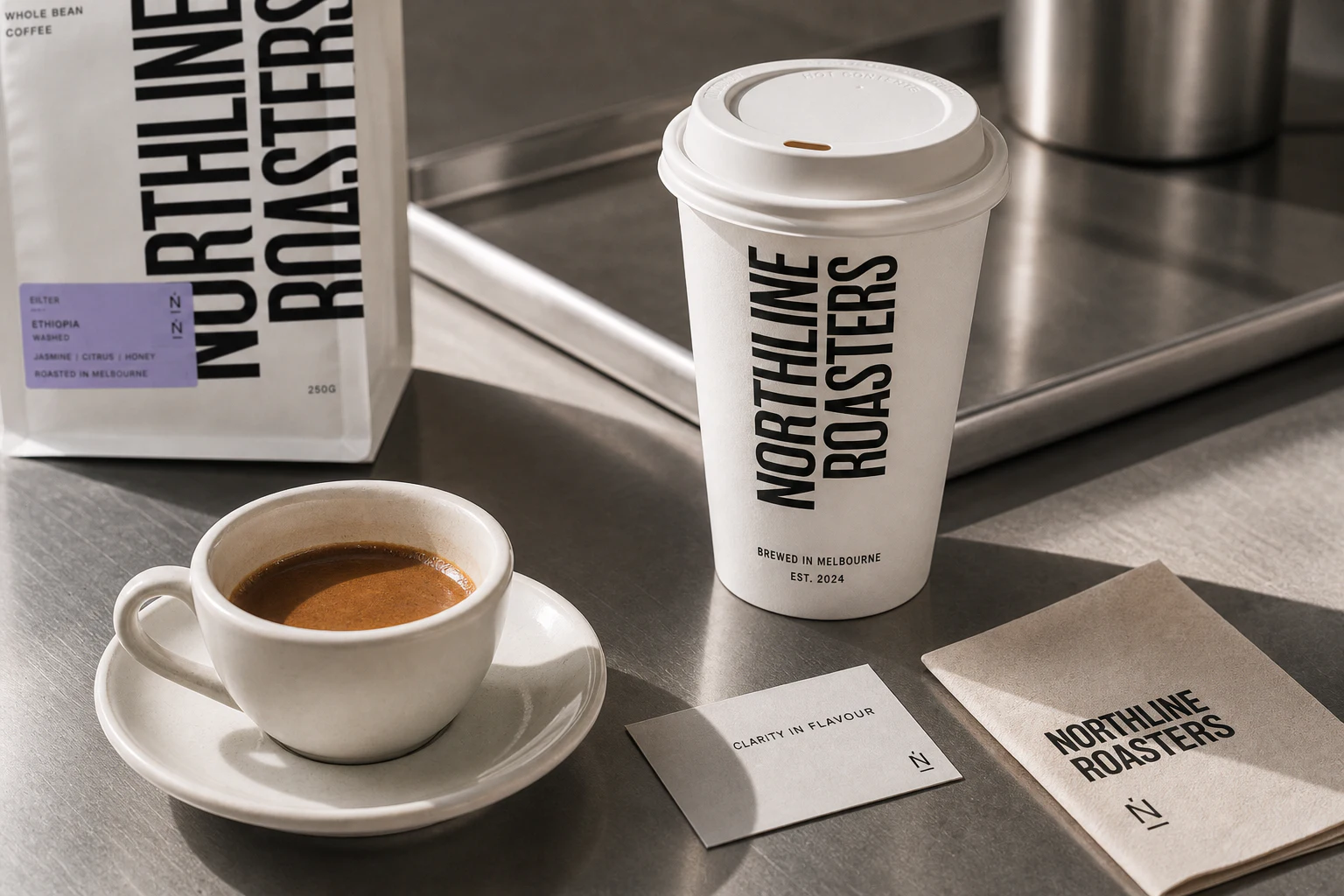
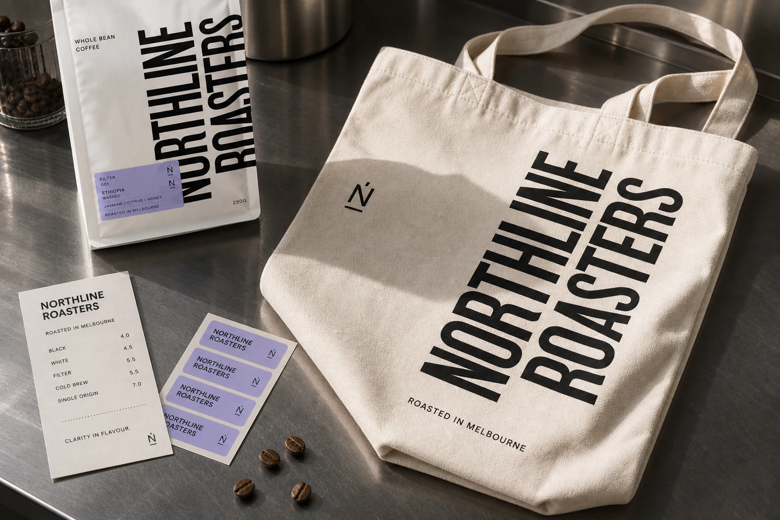
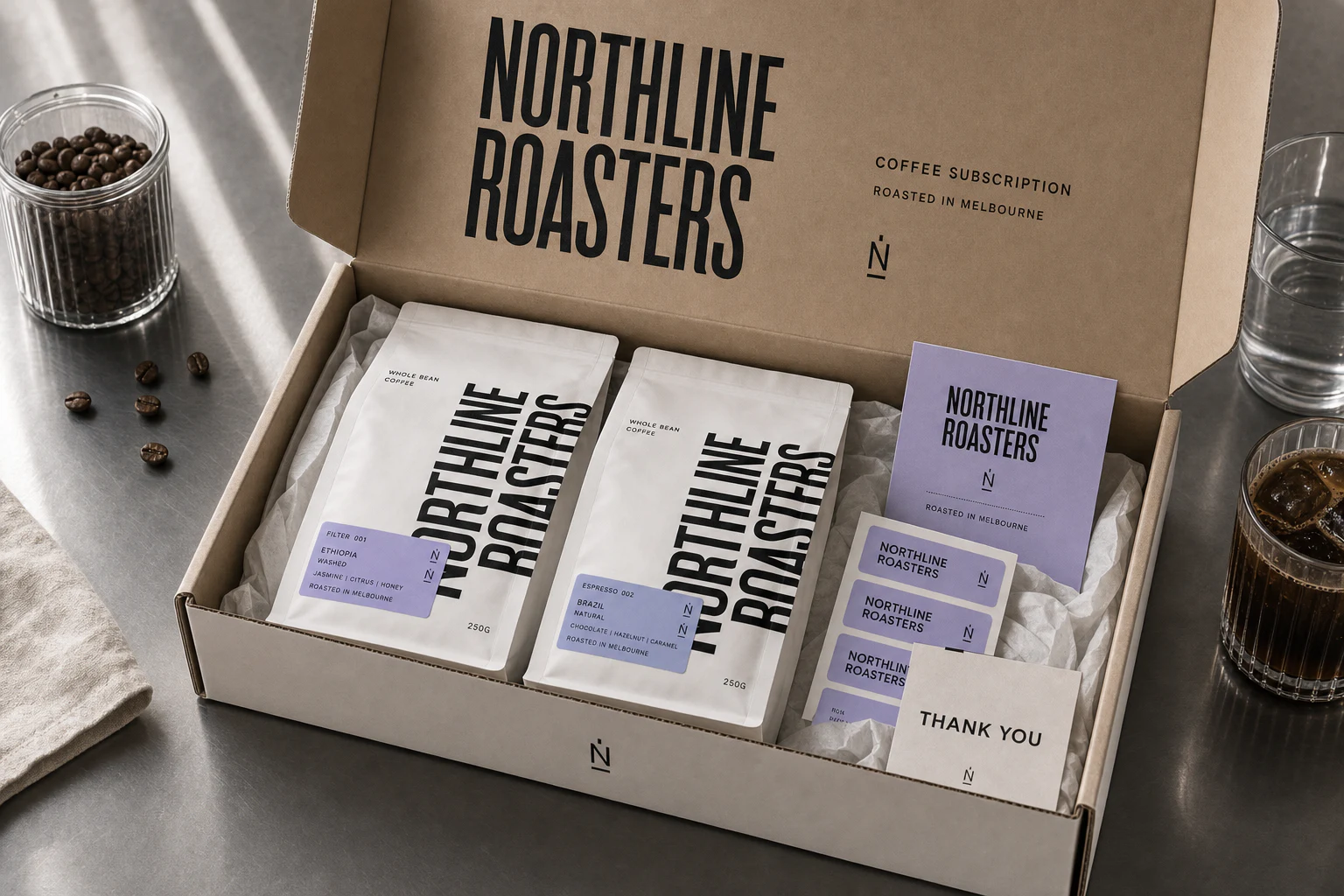
ApplicationThe identity is tested across coffee bags, counter pieces, takeaway formats, menus and digital launch assets so every customer touchpoint reads as Northline.
OutcomeA practical coffee brand system with enough distinction for the shelf and enough discipline for daily service, future blends and new locations.